
Metropolis
Designed By
Chris Simpson
18 Styles Sans Serif
Letters for
every day.
Metropolis · Regular
Compare the family in headings, short labels and paragraph text.
18 styles available. Compare the specimens below, or enter your own text.
Download Metropolis ↓TTF · The Unlicense
Set Your Own Text
Change the style and size to compare the letterforms.
Night bus to the city center
A Clear Hierarchy
Metropolis · Regular
Headings, labels and running text.
Departures09:00 →
Before You Travel
The morning service leaves at nine. Tickets are available at the station, and the platform is listed on the departure board. Keep your ticket until the end of the journey.
18 Styles,
One Family
Every available style is shown below in its own font file.
Thin100
Night bus to the city center
Thin Italic100
Night bus to the city center
Extra Light200
Night bus to the city center
Extra Light Italic200
Night bus to the city center
Light300
Night bus to the city center
Light Italic300
Night bus to the city center
Regular400
Night bus to the city center
Italic400
Night bus to the city center
Medium500
Night bus to the city center
Medium Italic500
Night bus to the city center
Semi Bold600
Night bus to the city center
Semi Bold Italic600
Night bus to the city center
Bold700
Night bus to the city center
Bold Italic700
Night bus to the city center
Extra Bold800
Night bus to the city center
Extra Bold Italic800
Night bus to the city center
Black900
Night bus to the city center
Black Italic900
Night bus to the city center
Chris Simpson admits in his notes that he never made peace with the lowercase a in Metropolis. He left it alone anyway, preferring an original shape to a familiar one, and that small stubbornness runs through the whole design: he drew straight into Glyphs with the pen tool, no sketches on paper first, and improvised the outlines as he went.
The spacing he did not do by hand. HT Letterspacer, a Glyphs plugin, worked out the sidebearings, and the kerning came out of BubbleKern. The italics came mostly from the Cursify tool, at an angle of 11.75 degrees, because he liked what it gave him better than a plain slant.
His own summary of the face is a modern geometric sans, influenced by the minimalist geometric typefaces of the new millennium and meant to stay readable at small point sizes.
18 styles, Thin to Black with an italic for each, all interpolated from 6 masters. The glyph set is Latin only, 307 characters, and kerning is the only OpenType feature, so there are no alternates to hunt for.
Interface labels and a brand’s headings suit it best, in our view, in the Regular to Bold range. Thin and ExtraLight are display weights.
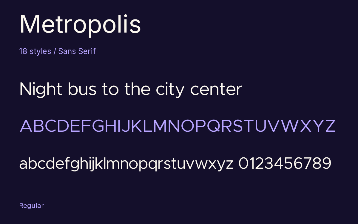
Characters & Figures
307 glyphs reported in the reference style. This selection shows 300 recorded characters.
ABCDEFGHIJKLMNOPQRSTUVWXYZ
abcdefghijklmnopqrstuvwxyz
0123456789 & @ ? !
View The Recorded Character Selection
The Font Files
Download
Metropolis
18 TTF styles with the accompanying CSS, README and license information.
Download ZIP · 608 KB ↓- Version
- 11.000
- License
- The Unlicense
Install On Your Computer
Extract the ZIP first. On Windows, select the font files and choose Install from the context menu. On macOS, open the files in Font Book and choose Install.
Use On A Website
Keep the font files and the included stylesheet together. Update the stylesheet path to match your project.
<link rel="stylesheet"
  href="/fonts/metropolis/metropolis.css">

body {
  font-family: 'Metropolis', sans-serif;
}
Keep the copyright and license notices with redistributed files.
Heading & Body
Compare a larger heading with the same family at reading size.
Metropolis Heading · Metropolis Body
Before You Travel
The morning service leaves at nine. Tickets are available at the station, and the platform is listed on the departure board. Keep your ticket until the end of the journey.