
Mukta
Designed By
Ek Type
7 Styles Sans Serif
Letters for
every day.
Mukta · Regular
Compare the family in headings, short labels and paragraph text.
7 styles available. Compare the specimens below, or enter your own text.
Download Mukta ↓TTF · SIL Open Font License 1.1
Set Your Own Text
Change the style and size to compare the letterforms.
Chai at the Dadar station
A Clear Hierarchy
Mukta · Regular
Headings, labels and running text.
Departures09:00 →
Before You Travel
The morning service leaves at nine. Tickets are available at the station, and the platform is listed on the departure board. Keep your ticket until the end of the journey.
7 Styles,
One Family
Every available style is shown below in its own font file.
Extra Light200
Chai at the Dadar station
Light300
Chai at the Dadar station
Regular400
Chai at the Dadar station
Medium500
Chai at the Dadar station
Semi Bold600
Chai at the Dadar station
Bold700
Chai at the Dadar station
Extra Bold800
Chai at the Dadar station
The hard part of a Hindi-English page is that 1 script usually wins. Pair Devanagari with a Latin font picked separately and the 2 rarely agree on weight or size, and the eye notices. Mukta was built against exactly that. Ek Type, a collective of type designers in Mumbai, wanted 1 family for each Indian script that would sit together in harmony without any script’s habits taking over the others, so that the fonts work alone or mixed.
This is the Devanagari and Latin member, drawn by Girish Dalvi and Yashodeep Gholap. The strokes keep 1 thickness throughout, humanist in structure, and it runs from Extra Light at 200 to Extra Bold at 800 in 7 steps. Gujarati, Gurmukhi and Tamil went to the sibling families Mukta Vaani, Mukta Mahee and Mukta Malar, drawn by other hands, Noopur Datye and Aadarsh Rajan among them.
Under the hood
More typographic kit than you’d expect from a Google family of 2017. Small caps, old style figures next to the tabular ones, fractions, 3 stylistic sets and a stack of alternates. The small caps let an English paragraph full of acronyms sit quietly beside the Hindi.
The Latin is compact, with a fairly small x-height, so we’d give English body text a size or 2 more than you would with a big-eyed sans.
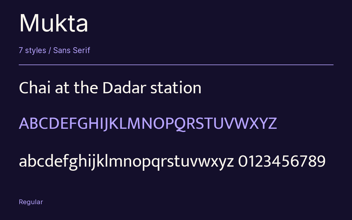
Characters & Figures
652 glyphs reported in the reference style. This selection shows 400 recorded characters.
ABCDEFGHIJKLMNOPQRSTUVWXYZ
abcdefghijklmnopqrstuvwxyz
0123456789 & @ ? !
View The Recorded Character Selection
The Font Files
Download
Mukta
7 TTF styles with the accompanying CSS, README and license information.
Download ZIP · 1.3 MB ↓- Version
- 2.538
- License
- SIL Open Font License 1.1
Install On Your Computer
Extract the ZIP first. On Windows, select the font files and choose Install from the context menu. On macOS, open the files in Font Book and choose Install.
Use On A Website
Keep the font files and the included stylesheet together. Update the stylesheet path to match your project.
<link rel="stylesheet"
  href="/fonts/mukta/mukta.css">

body {
  font-family: 'Mukta', sans-serif;
}
Keep the copyright and license notices with redistributed files.
Heading & Body
Compare a larger heading with the same family at reading size.
Mukta Heading · Mukta Body
Before You Travel
The morning service leaves at nine. Tickets are available at the station, and the platform is listed on the departure board. Keep your ticket until the end of the journey.