
Noto Sans JP
Designed By
9 Styles Sans Serif
Letters for
every day.
Noto Sans JP · Regular
Compare the family in headings, short labels and paragraph text.
9 styles available. Compare the specimens below, or enter your own text.
Download Noto Sans JP ↓TTF · SIL Open Font License 1.1
Set Your Own Text
Change the style and size to compare the letterforms.
Last train to Kyoto, platform 11
A Clear Hierarchy
Noto Sans JP · Regular
Headings, labels and running text.
Departures09:00 →
Before You Travel
The morning service leaves at nine. Tickets are available at the station, and the platform is listed on the departure board. Keep your ticket until the end of the journey.
9 Styles,
One Family
Every available style is shown below in its own font file.
Thin100
Preview Thin · 2.8 MB
Last train to Kyoto, platform 11
Extra Light200
Preview Extra Light · 2.9 MB
Last train to Kyoto, platform 11
Light300
Preview Light · 3.0 MB
Last train to Kyoto, platform 11
Regular400
Last train to Kyoto, platform 11
Medium500
Preview Medium · 3.0 MB
Last train to Kyoto, platform 11
Semi Bold600
Preview Semi Bold · 3.0 MB
Last train to Kyoto, platform 11
Bold700
Preview Bold · 3.0 MB
Last train to Kyoto, platform 11
Extra Bold800
Preview Extra Bold · 3.0 MB
Last train to Kyoto, platform 11
Black900
Preview Black · 3.0 MB
Last train to Kyoto, platform 11
A Japanese sentence uses 3 scripts at once. Kanji carry the stems of nouns and verbs, hiragana fill in the grammar around them, and katakana turn up for loan words and emphasis, so a Japanese font is in fact 3 designs that have to agree on weight and size in every line. Noto Sans JP does that in an unmodulated sans, with 16,732 characters in each of its 9 weights. The most basic set of kanji is 2,136 characters, and this goes far past it.
In Google’s catalog it is a Noto family, part of the collection meant for every modern and ancient language. The drawing was done at Adobe. Ken Lunde served as project architect; production and the ideograph elements were Masataka Hattori’s part.
Which weight for reading? Regular or Light on a screen, we’d say. Thin at 100 gets faint in a dense kanji like 鬱, though it looks good in a big title, and Black at 900 is for a sign or a poster.
What else it carries:
- Hangul syllables and a full Latin with Vietnamese accents, so mixed Japanese, Korean and English copy stays in 1 family
- Localized forms, which swap glyph shapes where regional conventions differ
- Squared and circled Latin symbols of the kind seen in Japanese forms and timetables
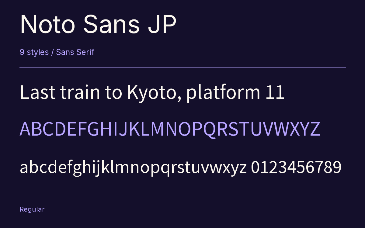
Characters & Figures
16,732 glyphs reported in the reference style. This selection shows 400 recorded characters.
ABCDEFGHIJKLMNOPQRSTUVWXYZ
abcdefghijklmnopqrstuvwxyz
0123456789 & @ ? !
View The Recorded Character Selection
The Font Files
Download
Noto Sans JP
9 TTF styles with the accompanying CSS, README and license information.
Download ZIP · 26.8 MB ↓- Version
- 2.004-H2
- License
- SIL Open Font License 1.1
Install On Your Computer
Extract the ZIP first. On Windows, select the font files and choose Install from the context menu. On macOS, open the files in Font Book and choose Install.
Use On A Website
Keep the font files and the included stylesheet together. Update the stylesheet path to match your project.
<link rel="stylesheet"
  href="/fonts/noto-sans-jp-2/noto-sans-jp-2.css">

body {
  font-family: 'Noto Sans JP', sans-serif;
}
Keep the copyright and license notices with redistributed files.
Heading & Body
Compare a larger heading with the same family at reading size.
Noto Sans JP Heading · Noto Sans JP Body
Before You Travel
The morning service leaves at nine. Tickets are available at the station, and the platform is listed on the departure board. Keep your ticket until the end of the journey.