
Noto Serif HK
Designed By
8 Styles Serif
The pleasure
of a well-set
page.
Noto Serif HK · Regular
Compare this serif family in headings and a continuous reading sample.
8 styles available. Compare the specimens below, or enter your own text.
Download Noto Serif HK ↓TTF · SIL Open Font License 1.1
Set Your Own Text
Change the style and size to compare the letterforms.
Last ferry to Lamma Island
A Page In Noto Serif HK
Noto Serif HK · Regular
Headings, labels and running text.
Notes From The Reading Room
The reading room opens onto a quiet courtyard. Along the shelves, small handwritten labels mark the collections. A visitor leaves a book open beside the window, keeping a place for the next reader.
A heading marks the next chapter. The margins leave room for a note while the text continues across the page.
8 Styles,
One Family
Every available style is shown below in its own font file.
Extra Light200
Preview Extra Light · 5.1 MB
Last ferry to Lamma Island
Light300
Preview Light · 5.5 MB
Last ferry to Lamma Island
Regular400
Last ferry to Lamma Island
Medium500
Preview Medium · 5.6 MB
Last ferry to Lamma Island
Semi Bold600
Preview Semi Bold · 5.6 MB
Last ferry to Lamma Island
Bold700
Preview Bold · 5.7 MB
Last ferry to Lamma Island
Extra Bold800
Preview Extra Bold · 5.7 MB
Last ferry to Lamma Island
Black900
Preview Black · 5.4 MB
Last ferry to Lamma Island
Somewhere between 2,100 and 2,500 Han characters will get a person through daily life, and an ordinary book or newspaper asks for 5,200 or more. A serif for Hong Kong has to draw every one of those in the same steady hand and then cope with the English and the odd Japanese or Korean name that turn up on the same page in that city. Noto Serif HK is Google’s answer, part of the Noto collection that sets out to cover all modern and ancient languages, and it follows the Traditional Chinese forms used for the languages of Hong Kong.
Adobe built it, with Dr. Ken Lunde as project architect who defined what the glyph set should hold, Masataka Hattori on the ideograph elements and Zachary Quinn Scheuren on the variable version.
This download carries 20,759 characters per style, in 8 weights from Extra Light at 200 to Black at 900. Kana, hangul and bopomofo are in there, so a quoted Japanese title does not drop into some fallback font halfway along a line.
For a bilingual shop sign or a menu, would you bother pairing it with a separate Latin face? We would not. The roman sits comfortably beside the ideographs, and the heavier weights hold up on a street fascia, while the Extra Light belongs on large covers where its thin strokes have room.
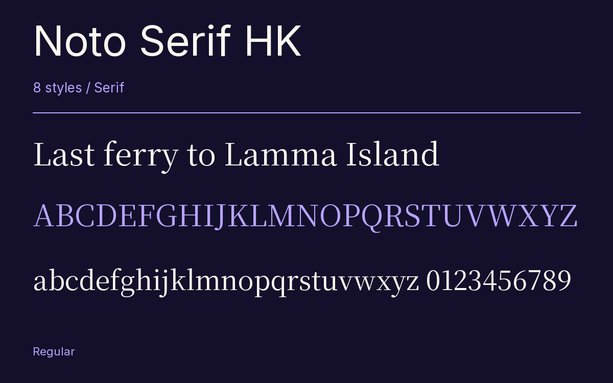
Characters & Figures
20,759 glyphs reported in the reference style. This selection shows 400 recorded characters.
ABCDEFGHIJKLMNOPQRSTUVWXYZ
abcdefghijklmnopqrstuvwxyz
0123456789 & @ ? !
View The Recorded Character Selection
The Font Files
Download
Noto Serif HK
8 TTF styles with the accompanying CSS, README and license information.
Download ZIP · 44.0 MB ↓- Version
- 2.003-H1
- License
- SIL Open Font License 1.1
Install On Your Computer
Extract the ZIP first. On Windows, select the font files and choose Install from the context menu. On macOS, open the files in Font Book and choose Install.
Use On A Website
Keep the font files and the included stylesheet together. Update the stylesheet path to match your project.
<link rel="stylesheet"
  href="/fonts/noto-serif-hk-2/noto-serif-hk-2.css">

body {
  font-family: 'Noto Serif HK', sans-serif;
}
Keep the copyright and license notices with redistributed files.
Heading & Body
The family provides the heading; Inter carries the supporting text.
Noto Serif HK Heading · Inter Body
Notes From The Reading Room
The reading room opens onto a quiet courtyard. Along the shelves, small handwritten labels mark the collections. A visitor leaves a book open beside the window, keeping a place for the next reader.