
Bona Nova
Designed By
Capitalics, Mateusz Machalski, Andrzej Heidrich
3 Styles Serif
The pleasure
of a well-set
page.
Bona Nova · Regular
Compare this serif family in headings and a continuous reading sample.
3 styles available. Compare the specimens below, or enter your own text.
Download Bona Nova ↓TTF · SIL Open Font License 1.1
Set Your Own Text
Change the style and size to compare the letterforms.
Chapter 4: The winter letters
A Page In Bona Nova
Bona Nova · Regular
Headings, labels and running text.
Notes From The Reading Room
The reading room opens onto a quiet courtyard. Along the shelves, small handwritten labels mark the collections. A visitor leaves a book open beside the window, keeping a place for the next reader.
A heading marks the next chapter. The margins leave room for a note while the text continues across the page.
3 Styles,
One Family
Every available style is shown below in its own font file.
Regular400
Chapter 4: The winter letters
Italic400
Chapter 4: The winter letters
Bold700
Chapter 4: The winter letters
Andrzej Heidrich, the artist who designed Poland’s banknotes, drew a cursive typeface called Bona in 1971. Mateusz Machalski of Capitalics brought it into digital form as Bona Nova, and the project went well past a straight copy: a far larger character set, small caps, alternates, a full OpenType kit. Then the 2 of them, working together, drew a new Regular and Bold to stand beside the cursive, which turned a single typeface into the classic trio.
So the Italic is the old face, and the uprights are the new ones.
You can see it in the widths. The italic runs about 13% narrower than the roman across a line, what you would expect from a design that began life as a cursive of its own, and a quoted phrase or a book title in it pulls in tight.
Small caps (with a switch for typed capitals), old style and tabular figures, 4 stylistic sets. The character set reaches Greek, Cyrillic, Hebrew and Vietnamese, unusual reach for a family of 3 styles.
The lowercase is short. We would set it on paper at book sizes before we put it on a phone.
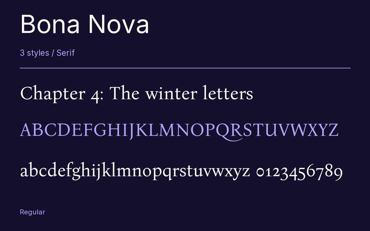
Characters & Figures
1,384 glyphs reported in the reference style. This selection shows 400 recorded characters.
ABCDEFGHIJKLMNOPQRSTUVWXYZ
abcdefghijklmnopqrstuvwxyz
0123456789 & @ ? !
View The Recorded Character Selection
The Font Files
Download
Bona Nova
3 TTF styles with the accompanying CSS, README and license information.
Download ZIP · 561 KB ↓- Version
- 4.001
- License
- SIL Open Font License 1.1
Install On Your Computer
Extract the ZIP first. On Windows, select the font files and choose Install from the context menu. On macOS, open the files in Font Book and choose Install.
Use On A Website
Keep the font files and the included stylesheet together. Update the stylesheet path to match your project.
<link rel="stylesheet"
  href="/fonts/bona-nova-2/bona-nova-2.css">

body {
  font-family: 'Bona Nova', sans-serif;
}
Keep the copyright and license notices with redistributed files.
Heading & Body
The family provides the heading; Inter carries the supporting text.
Bona Nova Heading · Inter Body
Notes From The Reading Room
The reading room opens onto a quiet courtyard. Along the shelves, small handwritten labels mark the collections. A visitor leaves a book open beside the window, keeping a place for the next reader.
Other Serif Families
Browse All Serif Fonts →- RedactionSerif3 StylesBunny Fonts
- TienneSerif3 StylesGoogle Fonts
 Serif1 StyleFontshare
- AdaminaSerif1 StyleGoogle Fonts
- Young SerifSerif1 StyleGoogle Fonts
- Noto Serif SCSerif8 StylesGoogle Fonts