
Petrona
Designed By
Ringo R. Seeber
18 Styles Serif
The pleasure
of a well-set
page.
Petrona · Regular
Compare this serif family in headings and a continuous reading sample.
18 styles available. Compare the specimens below, or enter your own text.
Download Petrona ↓TTF · SIL Open Font License 1.1
Set Your Own Text
Change the style and size to compare the letterforms.
Add the basil at the very end
A Page In Petrona
Petrona · Regular
Headings, labels and running text.
Notes From The Reading Room
The reading room opens onto a quiet courtyard. Along the shelves, small handwritten labels mark the collections. A visitor leaves a book open beside the window, keeping a place for the next reader.
A heading marks the next chapter. The margins leave room for a note while the text continues across the page.
18 Styles,
One Family
Every available style is shown below in its own font file.
Thin100
Add the basil at the very end
Thin Italic100
Add the basil at the very end
Extra Light200
Add the basil at the very end
Extra Light Italic200
Add the basil at the very end
Light300
Add the basil at the very end
Light Italic300
Add the basil at the very end
Regular400
Add the basil at the very end
Italic400
Add the basil at the very end
Medium500
Add the basil at the very end
Medium Italic500
Add the basil at the very end
Semi Bold600
Add the basil at the very end
Semi Bold Italic600
Add the basil at the very end
Bold700
Add the basil at the very end
Bold Italic700
Add the basil at the very end
Extra Bold800
Add the basil at the very end
Extra Bold Italic800
Add the basil at the very end
Black900
Add the basil at the very end
Black Italic900
Add the basil at the very end
Switch on Stylistic Set 1 and the Q gets its old swash back. That letter is a leftover from the first Petrona, a lone roman that went up on Google Fonts in November 2011. Ringo R. Seeber of Glyph Co in Brooklyn then redrew the whole thing in 2019 and 2020, and the single style grew into a full family.
His starting question was how much personality a text face can carry before it stops being a text face. Seeber’s own description reaches for a kitchen picture, the home cook who changes a recipe with personal touches and keeps what makes the dish work. You can find that in the capitals: heavy serifs that are not symmetrical, and arms cut at inverted angles. The lowercase is calmer, with a big x-height, tall ascenders and soft, low contrast curves, so the quirks sit mostly up top and a paragraph still reads easily.
The redraw filled in everything a book designer expects:
- 9 weights, Thin to Black, with matching italics
- small caps and a set of ligatures
- old style and lining figures, tabular or proportional, and fractions
- Latin for over 200 languages
The italics run noticeably narrower than the romans, some 9% over a line, which suits them for emphasis and for titles in a running text.
We would try it on a cookbook, naturally, or on a long read on a food site, Regular for the body and the Black, used sparingly, for the dish names.
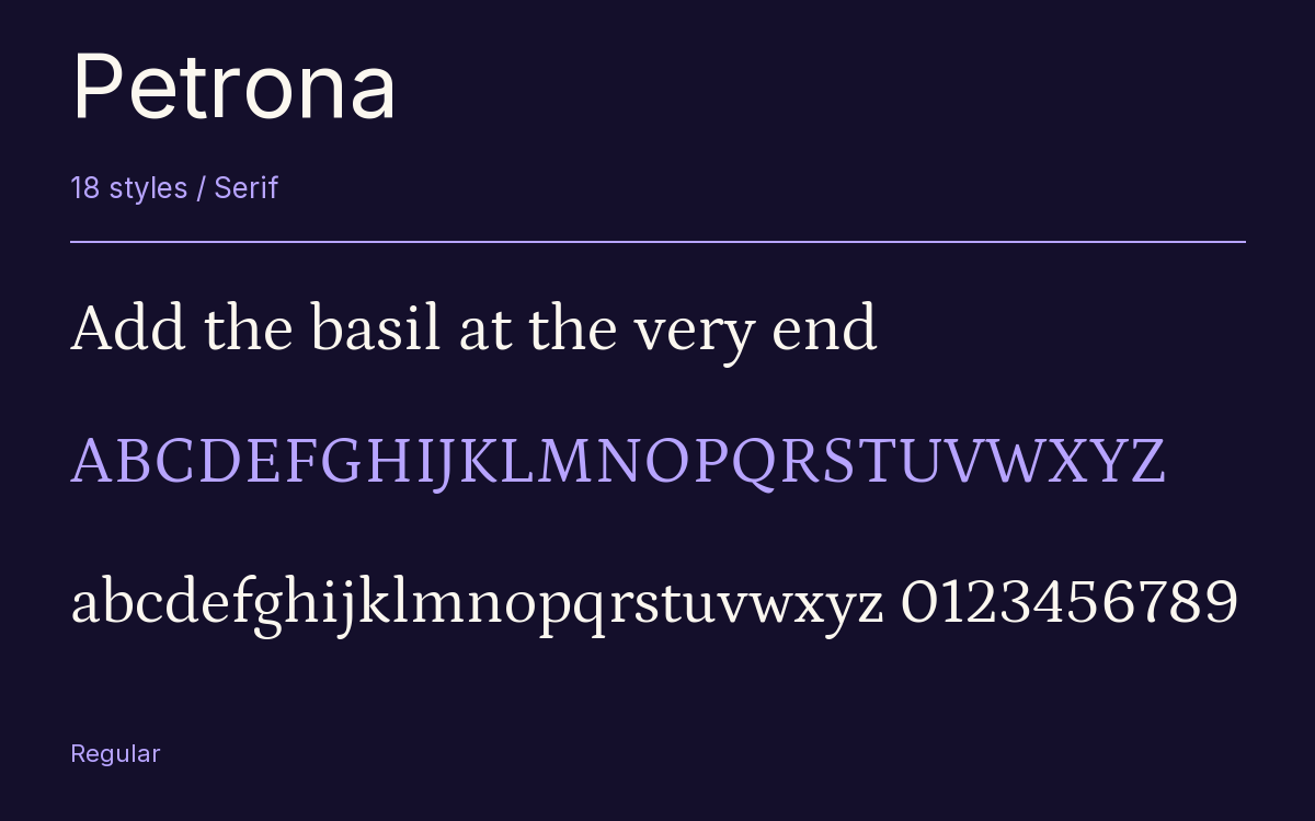
Characters & Figures
709 glyphs reported in the reference style. This selection shows 400 recorded characters.
ABCDEFGHIJKLMNOPQRSTUVWXYZ
abcdefghijklmnopqrstuvwxyz
0123456789 & @ ? !
View The Recorded Character Selection
The Font Files
Download
Petrona
18 TTF styles with the accompanying CSS, README and license information.
Download ZIP · 1.1 MB ↓- Version
- 2.001
- License
- SIL Open Font License 1.1
Install On Your Computer
Extract the ZIP first. On Windows, select the font files and choose Install from the context menu. On macOS, open the files in Font Book and choose Install.
Use On A Website
Keep the font files and the included stylesheet together. Update the stylesheet path to match your project.
<link rel="stylesheet"
  href="/fonts/petrona/petrona.css">

body {
  font-family: 'Petrona', sans-serif;
}
Keep the copyright and license notices with redistributed files.
Heading & Body
The family provides the heading; Inter carries the supporting text.
Petrona Heading · Inter Body
Notes From The Reading Room
The reading room opens onto a quiet courtyard. Along the shelves, small handwritten labels mark the collections. A visitor leaves a book open beside the window, keeping a place for the next reader.