
Frank Ruhl Libre
Designed By
Yanek Iontef
7 Styles Serif
The pleasure
of a well-set
page.
Frank Ruhl Libre · Regular
Compare this serif family in headings and a continuous reading sample.
7 styles available. Compare the specimens below, or enter your own text.
Download Frank Ruhl Libre ↓TTF · SIL Open Font License 1.1
Set Your Own Text
Change the style and size to compare the letterforms.
Notes from a Haifa bookshop
A Page In Frank Ruhl Libre
Frank Ruhl Libre · Regular
Headings, labels and running text.
Notes From The Reading Room
The reading room opens onto a quiet courtyard. Along the shelves, small handwritten labels mark the collections. A visitor leaves a book open beside the window, keeping a place for the next reader.
A heading marks the next chapter. The margins leave room for a note while the text continues across the page.
7 Styles,
One Family
Every available style is shown below in its own font file.
Light300
Notes from a Haifa bookshop
Regular400
Notes from a Haifa bookshop
Medium500
Notes from a Haifa bookshop
Semi Bold600
Notes from a Haifa bookshop
Bold700
Notes from a Haifa bookshop
Extra Bold800
Notes from a Haifa bookshop
Black900
Notes from a Haifa bookshop
Pick up an Israeli novel or a newspaper and the chances are good that its text is set in Frank Rühl. Rafael Frank designed the face in 1908 together with the C. F. Rühl foundry in Leipzig, and the final version came out in 1910. It answered a growing demand for type for secular Hebrew writing, and it had to hold up through long runs of text, with vowel points or without them.
Frank wrote that he wanted the plainness of Antiqua joined to the warmth of Fraktur. To get there he calmed the letters down, cutting back the contrast between thick and thin. The proportions are Sephardi, with a mem about 4½ stroke widths tall, and the shapes lean on the Venetian Hebrew types of the printer Daniel Bomberg.
The original had a single weight. Yanek Iontef’s revival at Fontef runs to 7, Light to Black, and in November 2022 it went variable on top of that. A Latin comes with it.
Can a 1908 book face hold up on a phone? Better than most, we think. The low contrast that Frank chose for the printing presses of his day suits screens too, and the Black makes a firm Hebrew headline without turning blotchy.
On the Latin side the figures cover old style and lining, tabular and proportional, plus fractions and ordinals, so a bilingual annual report or a footnoted essay will not run short.
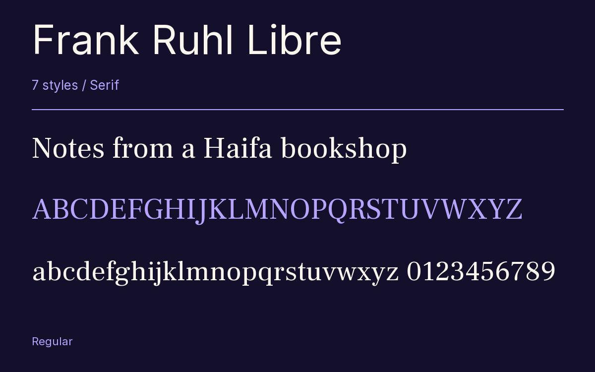
Characters & Figures
520 glyphs reported in the reference style. This selection shows 400 recorded characters.
ABCDEFGHIJKLMNOPQRSTUVWXYZ
abcdefghijklmnopqrstuvwxyz
0123456789 & @ ? !
View The Recorded Character Selection
The Font Files
Download
Frank Ruhl Libre
7 TTF styles with the accompanying CSS, README and license information.
Download ZIP · 248 KB ↓- Version
- 6.004
- License
- SIL Open Font License 1.1
Install On Your Computer
Extract the ZIP first. On Windows, select the font files and choose Install from the context menu. On macOS, open the files in Font Book and choose Install.
Use On A Website
Keep the font files and the included stylesheet together. Update the stylesheet path to match your project.
<link rel="stylesheet"
  href="/fonts/frank-ruhl-libre-2/frank-ruhl-libre-2.css">

body {
  font-family: 'Frank Ruhl Libre', sans-serif;
}
Keep the copyright and license notices with redistributed files.
Heading & Body
The family provides the heading; Inter carries the supporting text.
Frank Ruhl Libre Heading · Inter Body
Notes From The Reading Room
The reading room opens onto a quiet courtyard. Along the shelves, small handwritten labels mark the collections. A visitor leaves a book open beside the window, keeping a place for the next reader.