
Platypi
Designed By
David Sargent
12 Styles Serif
The pleasure
of a well-set
page.
Platypi · Regular
Compare this serif family in headings and a continuous reading sample.
12 styles available. Compare the specimens below, or enter your own text.
Download Platypi ↓TTF · SIL Open Font License 1.1
Set Your Own Text
Change the style and size to compare the letterforms.
Field notes from the river bend
A Page In Platypi
Platypi · Regular
Headings, labels and running text.
Notes From The Reading Room
The reading room opens onto a quiet courtyard. Along the shelves, small handwritten labels mark the collections. A visitor leaves a book open beside the window, keeping a place for the next reader.
A heading marks the next chapter. The margins leave room for a note while the text continues across the page.
12 Styles,
One Family
Every available style is shown below in its own font file.
Light300
Field notes from the river bend
Light Italic300
Field notes from the river bend
Regular400
Field notes from the river bend
Italic400
Field notes from the river bend
Medium500
Field notes from the river bend
Medium Italic500
Field notes from the river bend
Semi Bold600
Field notes from the river bend
Semi Bold Italic600
Field notes from the river bend
Bold700
Field notes from the river bend
Bold Italic700
Field notes from the river bend
Extra Bold800
Field notes from the river bend
Extra Bold Italic800
Field notes from the river bend
David Sargent will tell you himself that platypi is the wrong plural. It is pseudo-Latin, and the proper form is platypuses. He used it anyway, for a typeface that mixes parts you would not expect to find on the same animal, which is the point of the Australian platypus too.
The odd part is the serifs. They are sharp, heavy wedges of the kind usually kept for display faces, and Sargent fixed them to fairly conventional curves and proportions so that the whole thing still works as a text face, with a rhythm of its own. Further up the weights he pushes the tension harder, with more taper in the strokes and more contrast.
6 weights from Light to Extra Bold, each with an italic. It supports Indigenous Australian languages and Vietnamese, carrying Google’s full Latin Plus set, and Google added it in March 2024. The figures come tabular or proportional, there is a slashed zero, and discretionary ligatures wait to be switched on.
It sets wide, so a novel in it would lose words off every line. We’d give it feature intros and web headlines in Medium or Semi Bold, where those wedges have room to show.
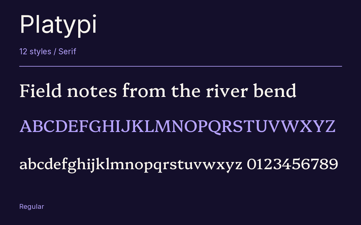
Characters & Figures
621 glyphs reported in the reference style. This selection shows 400 recorded characters.
ABCDEFGHIJKLMNOPQRSTUVWXYZ
abcdefghijklmnopqrstuvwxyz
0123456789 & @ ? !
View The Recorded Character Selection
The Font Files
Download
Platypi
12 TTF styles with the accompanying CSS, README and license information.
Download ZIP · 649 KB ↓- Version
- 1.200
- License
- SIL Open Font License 1.1
Install On Your Computer
Extract the ZIP first. On Windows, select the font files and choose Install from the context menu. On macOS, open the files in Font Book and choose Install.
Use On A Website
Keep the font files and the included stylesheet together. Update the stylesheet path to match your project.
<link rel="stylesheet"
  href="/fonts/platypi/platypi.css">

body {
  font-family: 'Platypi', sans-serif;
}
Keep the copyright and license notices with redistributed files.
Heading & Body
The family provides the heading; Inter carries the supporting text.
Platypi Heading · Inter Body
Notes From The Reading Room
The reading room opens onto a quiet courtyard. Along the shelves, small handwritten labels mark the collections. A visitor leaves a book open beside the window, keeping a place for the next reader.
Other Serif Families
Browse All Serif Fonts →- TavirajSerif18 StylesGoogle Fonts
 Serif1 StyleFontshare
- Roboto SerifSerif18 StylesGoogle Fonts
- Redaction 70Serif3 StylesBunny Fonts
- MarcellusSerif1 StyleGoogle Fonts
- PT SerifSerif4 StylesGoogle Fonts