
Gambarino
Designed By
Théo Guillard
1 Style Serif

Gambarino · Regular
View the family information below and visit the publisher for font files and usage terms.
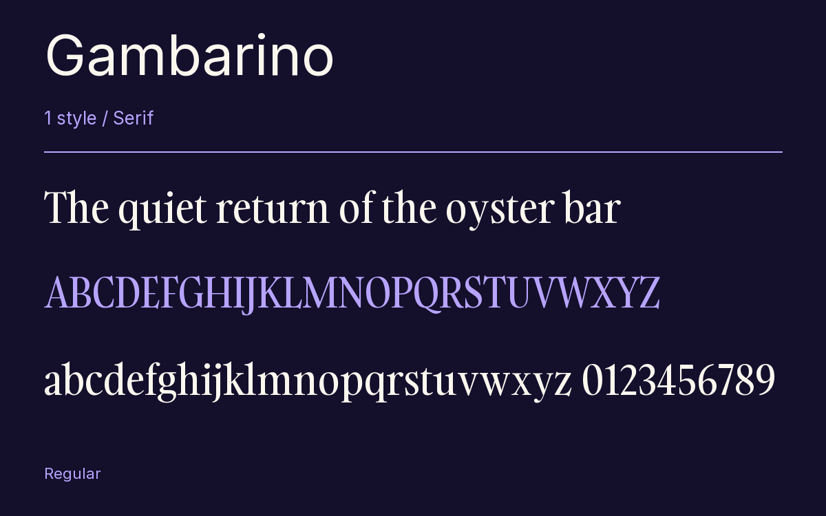
1 style available. The specimen image shows the family; live testing is available from its publisher.
Get Gambarino ↓TTF · ITF Free Font License
1 Style,
One Family
Style names from the catalog. Visit the publisher to test each style.
Regular400
The capitals in Gambarino are top-heavy on purpose. In B, E, F, P and R the upper half is the larger one, and it is the first thing you notice in a headline set in it. Théo Guillard drew the face for Indian Type Foundry as a post-modern reading of the Garalde, meant to sit above a conventional Garalde text face.
The serifs are very fine, the terminals on a, f and y end in teardrops, and the x-height is tall over tiny descenders, which left Guillard a problem with the g. He solved it with a special construction that balances the 2 bowls.
1 weight, condensed, made for headlines. We would put a classic Garalde text underneath and let Gambarino take the magazine titles.
The Font Files
Download
Gambarino
Obtain the original files from the publisher. Its terms govern download and use.
Visit The Publisher ↗Read The Font License ↗Download From The Publisher
This family is listed for reference. Font files are supplied by the publisher under its own terms.