
EB Garamond
Designed By
Georg Duffner, Octavio Pardo
10 Styles Serif
The pleasure
of a well-set
page.
EB Garamond · Regular
Compare this serif family in headings and a continuous reading sample.
10 styles available. Compare the specimens below, or enter your own text.
Download EB Garamond ↓TTF · SIL Open Font License 1.1
Set Your Own Text
Change the style and size to compare the letterforms.
Set from a specimen of 1592
A Page In EB Garamond
EB Garamond · Regular
Headings, labels and running text.
Notes From The Reading Room
The reading room opens onto a quiet courtyard. Along the shelves, small handwritten labels mark the collections. A visitor leaves a book open beside the window, keeping a place for the next reader.
A heading marks the next chapter. The margins leave room for a note while the text continues across the page.
10 Styles,
One Family
Every available style is shown below in its own font file.
Regular400
Set from a specimen of 1592
Italic400
Set from a specimen of 1592
Medium500
Set from a specimen of 1592
Medium Italic500
Set from a specimen of 1592
Semi Bold600
Set from a specimen of 1592
Semi Bold Italic600
Set from a specimen of 1592
Bold700
Set from a specimen of 1592
Bold Italic700
Set from a specimen of 1592
Extra Bold800
Set from a specimen of 1592
Extra Bold Italic800
Set from a specimen of 1592
In 1592 Conrad Berner printed a type specimen at the Egenolff print office, the shop he had taken over from his father-in-law Christian Egenolff. On its pages Claude Garamont’s roman sat beside Granjon’s italic in a run of sizes. EB Garamond is drawn from a scan of that sheet, and the E and B in the name are Egenolff and Berner, a better piece of credit than most revivals bother to give.
Georg Duffner started it. Octavio Pardo later led a fork, and the family is now kept up by contributors including the Google Fonts team, who have listed it since 2011. Why another Garamond, when it is probably the most revived typeface anywhere? Because in free software there was nothing Garamond-shaped of this size.
And it is big. 10 styles from Regular up to Extra Bold, each with its italic, and 2,091 characters in every file, enough for Latin, Greek, Cyrillic and Vietnamese. The OpenType side is the bookish part:
- true small caps, plus a feature that turns capitals into them
- old style, lining, tabular and proportional figures
- discretionary ligatures, swashes and 7 stylistic sets
- superscripts, subscripts, ordinals and fractions
The small letters are short, reaching 62% of the capital height, and on a screen at text size that makes a paragraph look pale and a little cramped. Paper suits it better. If you do put it on the web, go up a couple of sizes from what you would give a modern sans and open the leading.
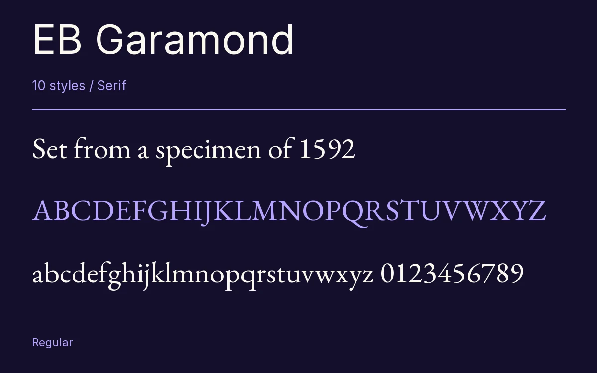
Characters & Figures
2,091 glyphs reported in the reference style. This selection shows 400 recorded characters.
ABCDEFGHIJKLMNOPQRSTUVWXYZ
abcdefghijklmnopqrstuvwxyz
0123456789 & @ ? !
View The Recorded Character Selection
The Font Files
Download
EB Garamond
10 TTF styles with the accompanying CSS, README and license information.
Download ZIP · 2.2 MB ↓- Version
- 1.001
- License
- SIL Open Font License 1.1
Install On Your Computer
Extract the ZIP first. On Windows, select the font files and choose Install from the context menu. On macOS, open the files in Font Book and choose Install.
Use On A Website
Keep the font files and the included stylesheet together. Update the stylesheet path to match your project.
<link rel="stylesheet"
  href="/fonts/eb-garamond-2/eb-garamond-2.css">

body {
  font-family: 'EB Garamond', sans-serif;
}
Keep the copyright and license notices with redistributed files.
Heading & Body
The family provides the heading; Inter carries the supporting text.
EB Garamond Heading · Inter Body
Notes From The Reading Room
The reading room opens onto a quiet courtyard. Along the shelves, small handwritten labels mark the collections. A visitor leaves a book open beside the window, keeping a place for the next reader.