
Plus Jakarta Sans
Designed By
Tokotype
14 Styles Sans Serif
Letters for
every day.
Plus Jakarta Sans · Regular
Compare the family in headings, short labels and paragraph text.
14 styles available. Compare the specimens below, or enter your own text.
Download Plus Jakarta Sans ↓TTF · SIL Open Font License 1.1
Set Your Own Text
Change the style and size to compare the letterforms.
Quarterly signups up 18%
A Clear Hierarchy
Plus Jakarta Sans · Regular
Headings, labels and running text.
Departures09:00 →
Before You Travel
The morning service leaves at nine. Tickets are available at the station, and the platform is listed on the departure board. Keep your ticket until the end of the journey.
14 Styles,
One Family
Every available style is shown below in its own font file.
Extra Light200
Quarterly signups up 18%
Extra Light Italic200
Quarterly signups up 18%
Light300
Quarterly signups up 18%
Light Italic300
Quarterly signups up 18%
Regular400
Quarterly signups up 18%
Italic400
Quarterly signups up 18%
Medium500
Quarterly signups up 18%
Medium Italic500
Quarterly signups up 18%
Semi Bold600
Quarterly signups up 18%
Semi Bold Italic600
Quarterly signups up 18%
Bold700
Quarterly signups up 18%
Bold Italic700
Quarterly signups up 18%
Extra Bold800
Quarterly signups up 18%
Extra Bold Italic800
Quarterly signups up 18%
Lancip, Lurus and Lingkar are Indonesian for sharp, straight and swirl, and they name the 3 stylistic sets in Plus Jakarta Sans. Open them if the default letters feel too familiar for a brand; each set carries its own alternates, and the designers meant them as small departures you notice only up close.
The family began as a city identity. 6616 Studio commissioned it in 2020 for +Jakarta City of Collaboration, a program of the Jakarta provincial government, and Gumpita Rahayu drew it at Tokotype. Rahayu looked at Neuzeit Grotesk, at Futura and at the grotesque sans faces of the 1930s, kept the stroke close to monolinear and gave the curves a pointed finish. The x-height went a little taller than in those models, enough to keep clear air between the lowercase and the capitals, and the counters were left open so the letters hold up at small sizes.
14 styles in all, 7 weights from Extra Light to Extra Bold with an italic for each. The italics keep almost exactly the width of the roman, so you can put a phrase in italic mid-paragraph and the line breaks stay where they were.
For product work the OpenType list is what you reach for. Tabular figures line up a price column, case sensitive forms lift hyphens and brackets in an all-caps button, and fractions and ordinals are built in. The 721 characters reach Vietnamese and extended Cyrillic.
Our pick would be Medium for interface text and Bold for headings. Extra Light is a poster weight and wants size.
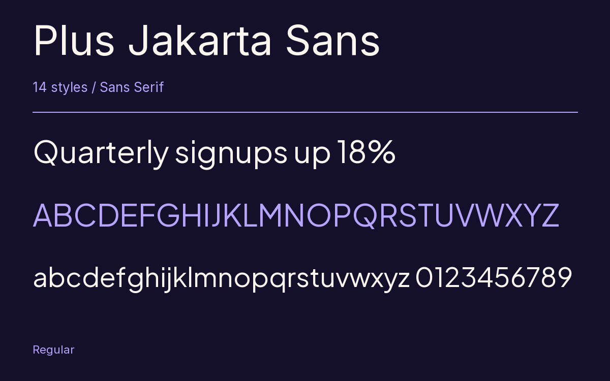
Characters & Figures
721 glyphs reported in the reference style. This selection shows 400 recorded characters.
ABCDEFGHIJKLMNOPQRSTUVWXYZ
abcdefghijklmnopqrstuvwxyz
0123456789 & @ ? !
View The Recorded Character Selection
The Font Files
Download
Plus Jakarta Sans
14 TTF styles with the accompanying CSS, README and license information.
Download ZIP · 617 KB ↓- Version
- 2.071
- License
- SIL Open Font License 1.1
Install On Your Computer
Extract the ZIP first. On Windows, select the font files and choose Install from the context menu. On macOS, open the files in Font Book and choose Install.
Use On A Website
Keep the font files and the included stylesheet together. Update the stylesheet path to match your project.
<link rel="stylesheet"
  href="/fonts/plus-jakarta-sans/plus-jakarta-sans.css">

body {
  font-family: 'Plus Jakarta Sans', sans-serif;
}
Keep the copyright and license notices with redistributed files.
Heading & Body
Compare a larger heading with the same family at reading size.
Plus Jakarta Sans Heading · Plus Jakarta Sans Body
Before You Travel
The morning service leaves at nine. Tickets are available at the station, and the platform is listed on the departure board. Keep your ticket until the end of the journey.