
Poltawski Nowy
Designed By
Adam Półtawski, Mateusz Machalski, Borys Kosmynka, Ania Wieluńska
8 Styles Serif
The pleasure
of a well-set
page.
Poltawski Nowy · Regular
Compare this serif family in headings and a continuous reading sample.
8 styles available. Compare the specimens below, or enter your own text.
Download Poltawski Nowy ↓TTF · SIL Open Font License 1.1
Set Your Own Text
Change the style and size to compare the letterforms.
Rozdział pierwszy, w którym pada śnieg
A Page In Poltawski Nowy
Poltawski Nowy · Regular
Headings, labels and running text.
Notes From The Reading Room
The reading room opens onto a quiet courtyard. Along the shelves, small handwritten labels mark the collections. A visitor leaves a book open beside the window, keeping a place for the next reader.
A heading marks the next chapter. The margins leave room for a note while the text continues across the page.
8 Styles,
One Family
Every available style is shown below in its own font file.
Regular400
Rozdział pierwszy, w którym pada śnieg
Italic400
Rozdział pierwszy, w którym pada śnieg
Medium500
Rozdział pierwszy, w którym pada śnieg
Medium Italic500
Rozdział pierwszy, w którym pada śnieg
Semi Bold600
Rozdział pierwszy, w którym pada śnieg
Semi Bold Italic600
Rozdział pierwszy, w którym pada śnieg
Bold700
Rozdział pierwszy, w którym pada śnieg
Bold Italic700
Rozdział pierwszy, w którym pada śnieg
Antykwa Półtawskiego is the most recognizable Polish typeface. Adam Półtawski designed it in 1928. Mateusz Machalski, Borys Kosmynka and Ania Wieluńska went back to the sources to bring it to the screen as Półtawski Nowy, “new Półtawski”.
The sources were good ones. They worked from scans of a type specimen book from the Idźkowski i S-ka foundry and from the drawings, punch patterns and punches Monotype made at Salfords, in Britain, between 1934 and 1955, all made available by the Type Archive in London. Historical research ran alongside the drawing, and it turned up the story of the typeface as the work went on.
The hard part was deciding how to turn those sources into consistent letters. The team standardized the characters and evened out the rhythm, so the face keeps its ornamental character but works at text sizes; they recommend 10 to 18 pt. Then they filled in what the original never had:
- further accented variants, reaching as far as Vietnamese
- small caps, subscripts and superscripts
- tabular, proportional and old-style figures
- a full set of OpenType features, including 7 stylistic sets
The family has 4 weights, Regular to Bold, each with an italic. Poland’s Ministry of Culture and National Heritage supported it through the Digital Culture 2020 program, and Capitalics released it.
For a Polish novel or a literary quarterly, this is the face to reach for. It has the look of interwar Polish printing, and with the new figures and small caps it can handle a modern book’s needs too.
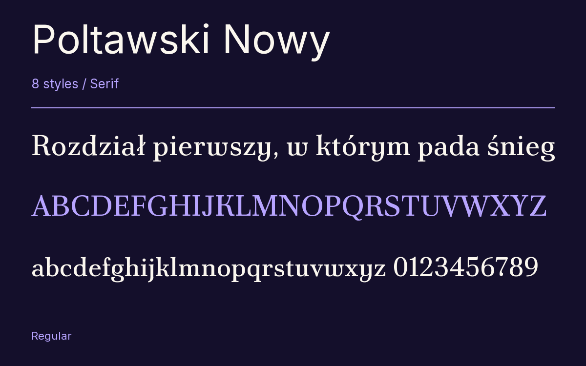
Characters & Figures
633 glyphs reported in the reference style. This selection shows 400 recorded characters.
ABCDEFGHIJKLMNOPQRSTUVWXYZ
abcdefghijklmnopqrstuvwxyz
0123456789 & @ ? !
View The Recorded Character Selection
The Font Files
Download
Poltawski Nowy
8 TTF styles with the accompanying CSS, README and license information.
Download ZIP · 924 KB ↓- Version
- 1.001
- License
- SIL Open Font License 1.1
Install On Your Computer
Extract the ZIP first. On Windows, select the font files and choose Install from the context menu. On macOS, open the files in Font Book and choose Install.
Use On A Website
Keep the font files and the included stylesheet together. Update the stylesheet path to match your project.
<link rel="stylesheet"
  href="/fonts/poltawski-nowy-2/poltawski-nowy-2.css">

body {
  font-family: 'Poltawski Nowy', sans-serif;
}
Keep the copyright and license notices with redistributed files.
Heading & Body
The family provides the heading; Inter carries the supporting text.
Poltawski Nowy Heading · Inter Body
Notes From The Reading Room
The reading room opens onto a quiet courtyard. Along the shelves, small handwritten labels mark the collections. A visitor leaves a book open beside the window, keeping a place for the next reader.