
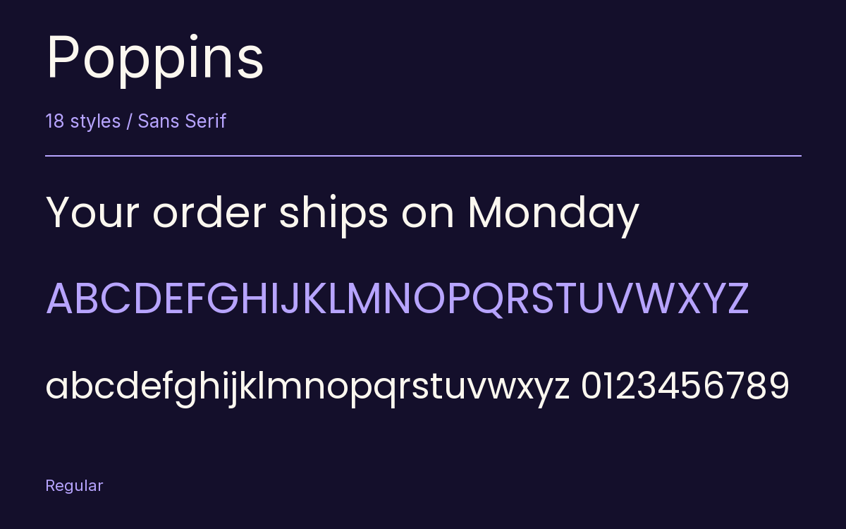
Poppins
Designed By
Indian Type Foundry, Jonny Pinhorn, Ninad Kale
18 Styles Sans Serif
Letters for
every day.
Poppins · Regular
Compare the family in headings, short labels and paragraph text.
18 styles available. Compare the specimens below, or enter your own text.
Download Poppins ↓TTF · SIL Open Font License 1.1
Set Your Own Text
Change the style and size to compare the letterforms.
Your order ships on Monday
A Clear Hierarchy
Poppins · Regular
Headings, labels and running text.
Departures09:00 →
Before You Travel
The morning service leaves at nine. Tickets are available at the station, and the platform is listed on the departure board. Keep your ticket until the end of the journey.
18 Styles,
One Family
Every available style is shown below in its own font file.
Thin100
Your order ships on Monday
Thin Italic100
Your order ships on Monday
Extra Light200
Your order ships on Monday
Extra Light Italic200
Your order ships on Monday
Light300
Your order ships on Monday
Light Italic300
Your order ships on Monday
Regular400
Your order ships on Monday
Italic400
Your order ships on Monday
Medium500
Your order ships on Monday
Medium Italic500
Your order ships on Monday
Semi Bold600
Your order ships on Monday
Semi Bold Italic600
Your order ships on Monday
Bold700
Your order ships on Monday
Bold Italic700
Your order ships on Monday
Extra Bold800
Your order ships on Monday
Extra Bold Italic800
Your order ships on Monday
Black900
Your order ships on Monday
Black Italic900
Your order ships on Monday
In 2015 nobody had made a geometric Devanagari with a full run of weights. Poppins was the first. Indian Type Foundry put it out with the Devanagari drawn by Ninad Kale and the Latin by Jonny Pinhorn, and both halves grow from the same plan: letters built out of circles and straight strokes, the line weight almost even all the way round, the joins trimmed wherever a stroke would otherwise pool into a dark spot.
The clever part is how the 2 scripts were lined up. The main body of a Devanagari letter, up to its headline, is as tall as a Latin ascender, and the Latin capitals stop short of that. To keep the small letters from looking lost beside the Devanagari, the Latin x-height was pushed up high, which is why English in Poppins looks large and round next to most sans faces.
Kale and Pinhorn drew the first 5 styles. After that the ITF studio refined them and spread them into the family you get now:
- 9 weights, Thin up to Black
- an italic for every weight, 18 styles in all
- 4 stylistic sets
Some of the Latin is stricter than a geometric sans tends to be. The ampersand, for one, is more assembled than drawn.
Where would we put it? Headings, buttons and labels in an interface, a bilingual menu with Hindi above English, slide titles. For long reading the wide round letters use up a lot of line, and the eye gets few cues to hold on to, so by page 3 of a report set in it you may want a serif back.
Characters & Figures
471 glyphs reported in the reference style. This selection shows 400 recorded characters.
ABCDEFGHIJKLMNOPQRSTUVWXYZ
abcdefghijklmnopqrstuvwxyz
0123456789 & @ ? !
View The Recorded Character Selection
The Font Files
Download
Poppins
18 TTF styles with the accompanying CSS, README and license information.
Download ZIP · 1.3 MB ↓- Version
- 4.004
- License
- SIL Open Font License 1.1
Install On Your Computer
Extract the ZIP first. On Windows, select the font files and choose Install from the context menu. On macOS, open the files in Font Book and choose Install.
Use On A Website
Keep the font files and the included stylesheet together. Update the stylesheet path to match your project.
<link rel="stylesheet"
  href="/fonts/poppins-fontshare/poppins-fontshare.css">

body {
  font-family: 'Poppins', sans-serif;
}
Keep the copyright and license notices with redistributed files.
Heading & Body
Compare a larger heading with the same family at reading size.
Poppins Heading · Poppins Body
Before You Travel
The morning service leaves at nine. Tickets are available at the station, and the platform is listed on the departure board. Keep your ticket until the end of the journey.