
Ranade
Designed By
Easha Ranade
1 Style Sans Serif
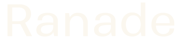
Ranade · Regular
View the family information below and visit the publisher for font files and usage terms.
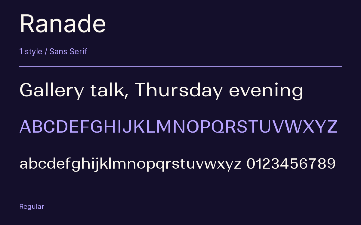
1 style available. The specimen image shows the family; live testing is available from its publisher.
Get Ranade ↓TTF · ITF Free Font License
1 Style,
One Family
Style names from the catalog. Visit the publisher to test each style.
Regular400
No capital in Ranade drops below the baseline. The J and the Q stay between the baseline and cap height, which lets lines of capitals sit close together without tangling. Easha Ranade developed the face at Indian Type Foundry in Ahmedabad as a neo-grotesk, and gave its diagonals a contrast you would expect from a serif, thin where a classic roman would be thin, all the way down to the lightest weight.
The family runs Thin to Bold with oblique-style italics, and you get the Regular here. It sets wide.
Branding and corporate work are where it was aimed. A stack of tightly leaded all caps lines on a poster would show off that short J and Q.
The Font Files
Download
Ranade
Obtain the original files from the publisher. Its terms govern download and use.
Visit The Publisher ↗Read The Font License ↗Download From The Publisher
This family is listed for reference. Font files are supplied by the publisher under its own terms.