
Recia
Designed By
Carlos de Toro
1 Style Serif

Recia · Regular
View the family information below and visit the publisher for font files and usage terms.
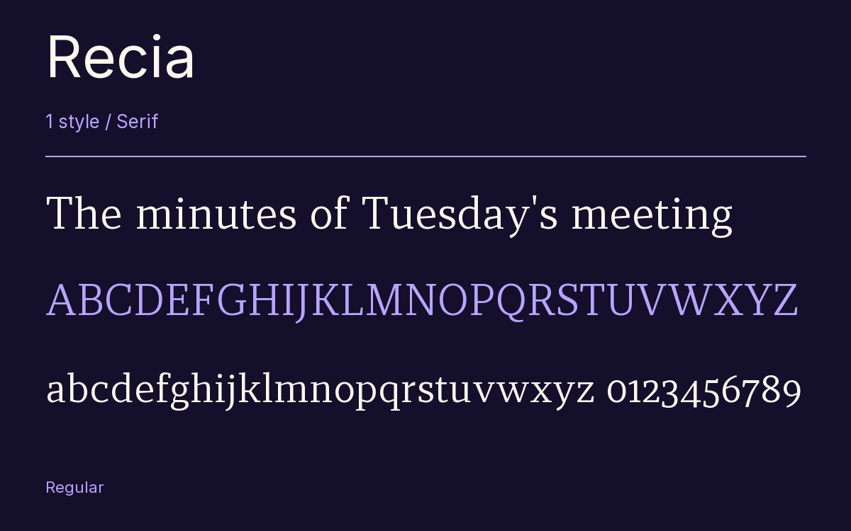
1 style available. The specimen image shows the family; live testing is available from its publisher.
Get Recia ↓TTF · ITF Free Font License
1 Style,
One Family
Style names from the catalog. Visit the publisher to test each style.
Regular400
Bad printing is what Recia was tuned against. Carlos de Toro made it for running text, and especially for jobs where poor printing calls for tough letters, so the contrast is kept low and the serifs are sturdy wedges. In the light weights you barely see any contrast at all; it only shows clearly in the Bold, and even there the thin strokes stay solid.
It was his first typeface with Indian Type Foundry, released through Fontshare. The x-height is tall, good news for small type on rough paper.
The full family runs from Light to Bold in 5 weights, each with a true cursive italic, 10 styles in all. Figures default to proportional old style, and OpenType switches give you lining, tabular, a slashed zero and fractions.
Our opinion: a local newspaper or an annual report printed on uncoated stock is the right test for this face, and it should pass.
The Font Files
Download
Recia
Obtain the original files from the publisher. Its terms govern download and use.
Visit The Publisher ↗Read The Font License ↗Download From The Publisher
This family is listed for reference. Font files are supplied by the publisher under its own terms.
Other Serif Families
Browse All Serif Fonts →- Noto Serif NP HmongSerif4 StylesGoogle Fonts
- Redaction 10Serif3 StylesBunny Fonts
 Serif1 StyleFontshare
- Noto Serif JPSerif8 StylesGoogle Fonts
- Libre BaskervilleSerif8 StylesGoogle Fonts
- MartelSerif7 StylesGoogle Fonts