
Noto Serif JP
Designed By
8 Styles Serif
The pleasure
of a well-set
page.
Noto Serif JP · Regular
Compare this serif family in headings and a continuous reading sample.
8 styles available. Compare the specimens below, or enter your own text.
Download Noto Serif JP ↓TTF · SIL Open Font License 1.1
Set Your Own Text
Change the style and size to compare the letterforms.
The first snow fell on Kyoto
A Page In Noto Serif JP
Noto Serif JP · Regular
Headings, labels and running text.
Notes From The Reading Room
The reading room opens onto a quiet courtyard. Along the shelves, small handwritten labels mark the collections. A visitor leaves a book open beside the window, keeping a place for the next reader.
A heading marks the next chapter. The margins leave room for a note while the text continues across the page.
8 Styles,
One Family
Every available style is shown below in its own font file.
Extra Light200
Preview Extra Light · 3.8 MB
The first snow fell on Kyoto
Light300
Preview Light · 4.0 MB
The first snow fell on Kyoto
Regular400
The first snow fell on Kyoto
Medium500
Preview Medium · 4.1 MB
The first snow fell on Kyoto
Semi Bold600
Preview Semi Bold · 4.1 MB
The first snow fell on Kyoto
Bold700
Preview Bold · 4.2 MB
The first snow fell on Kyoto
Extra Bold800
Preview Extra Bold · 4.2 MB
The first snow fell on Kyoto
Black900
Preview Black · 4.0 MB
The first snow fell on Kyoto
16,726 characters sit in each weight of this font. Japanese needs a lot of them: kanji carry the stems of most words, while hiragana handles the grammar and katakana takes loan words and emphasis, all mixed on the same line.
Adobe made it. Dr. Ken Lunde was project architect, defining the glyph set and steering production, with Masataka Hattori on the ideograph elements and Zachary Quinn Scheuren on the variable font. In Google’s catalog it belongs to the Noto collection.
It is a modulated design, with thick and thin strokes, built for texts in Japanese and the other languages used in Japan. Those Western alphabets come along, so a romanized name or a quotation from another language does not need a second font.
8 weights, Extra Light to Black. For a novel or a long article we would pick Regular, maybe Light on a high resolution screen, and keep the Black for a magazine cover line. The Latin is on the wide side for a serif, so English words in a Japanese paragraph take a little more room than you might expect.
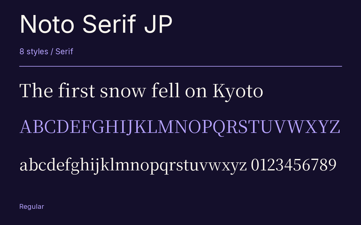
Characters & Figures
16,726 glyphs reported in the reference style. This selection shows 400 recorded characters.
ABCDEFGHIJKLMNOPQRSTUVWXYZ
abcdefghijklmnopqrstuvwxyz
0123456789 & @ ? !
View The Recorded Character Selection
The Font Files
Download
Noto Serif JP
8 TTF styles with the accompanying CSS, README and license information.
Download ZIP · 32.5 MB ↓- Version
- 2.003-H1
- License
- SIL Open Font License 1.1
Install On Your Computer
Extract the ZIP first. On Windows, select the font files and choose Install from the context menu. On macOS, open the files in Font Book and choose Install.
Use On A Website
Keep the font files and the included stylesheet together. Update the stylesheet path to match your project.
<link rel="stylesheet"
  href="/fonts/noto-serif-jp-2/noto-serif-jp-2.css">

body {
  font-family: 'Noto Serif JP', sans-serif;
}
Keep the copyright and license notices with redistributed files.
Heading & Body
The family provides the heading; Inter carries the supporting text.
Noto Serif JP Heading · Inter Body
Notes From The Reading Room
The reading room opens onto a quiet courtyard. Along the shelves, small handwritten labels mark the collections. A visitor leaves a book open beside the window, keeping a place for the next reader.