
REM
Designed By
Octavio Pardo
18 Styles Sans Serif
Letters for
every day.
REM · Regular
Compare the family in headings, short labels and paragraph text.
18 styles available. Compare the specimens below, or enter your own text.
Download REM ↓TTF · SIL Open Font License 1.1
Set Your Own Text
Change the style and size to compare the letterforms.
Woke up with the whole idea
A Clear Hierarchy
REM · Regular
Headings, labels and running text.
Departures09:00 →
Before You Travel
The morning service leaves at nine. Tickets are available at the station, and the platform is listed on the departure board. Keep your ticket until the end of the journey.
18 Styles,
One Family
Every available style is shown below in its own font file.
Thin100
Woke up with the whole idea
Thin Italic100
Woke up with the whole idea
Extra Light200
Woke up with the whole idea
Extra Light Italic200
Woke up with the whole idea
Light300
Woke up with the whole idea
Light Italic300
Woke up with the whole idea
Regular400
Woke up with the whole idea
Italic400
Woke up with the whole idea
Medium500
Woke up with the whole idea
Medium Italic500
Woke up with the whole idea
Semi Bold600
Woke up with the whole idea
Semi Bold Italic600
Woke up with the whole idea
Bold700
Woke up with the whole idea
Bold Italic700
Woke up with the whole idea
Extra Bold800
Woke up with the whole idea
Extra Bold Italic800
Woke up with the whole idea
Black900
Woke up with the whole idea
Black Italic900
Woke up with the whole idea
Octavio Pardo says he dreamt this typeface and started drawing it from the dream, so he named it REM, for rapid eye movement, the stage of sleep marked by quick, random movements of the eyes.
What he brought back is a sans with an odd detail in the strokes. The contrast is low and the weight heavy, yet the outstrokes, where a curve or a line runs out to its end, thin down slightly. He describes that as the opposite of the usual approach. At text size you will hardly see it. At 80 pt on a poster it gives the letters a contemporary finish, which is what Pardo had in mind for branding.
There is a serious kit behind the look:
- 9 weights, Thin to Black, all with italics
- true small caps, reachable from lowercase or from capitals
- 4 sets of figures, old style and lining in tabular and proportional cuts
- 3 stylistic sets of alternates
A corporate identity could run on it top to bottom, the Black for the logotype and the Light for a letterhead. We would keep the thinnest weights above 24 pt or so.
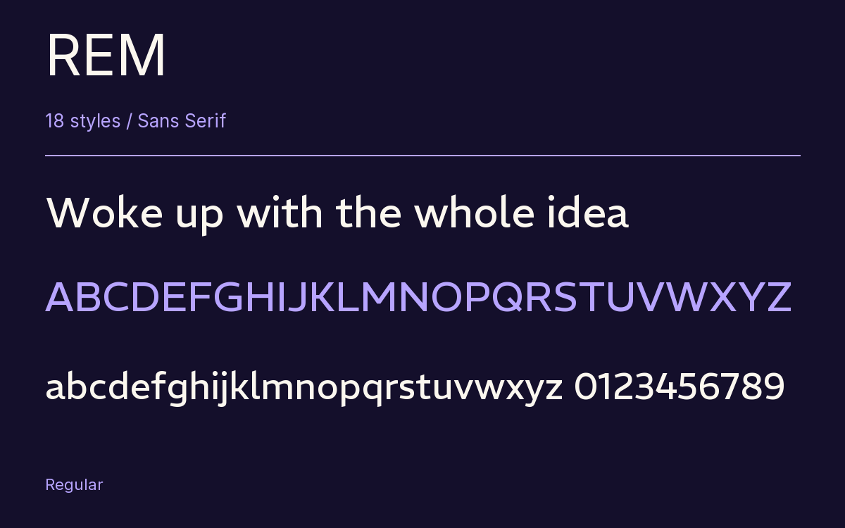
Characters & Figures
591 glyphs reported in the reference style. This selection shows 400 recorded characters.
ABCDEFGHIJKLMNOPQRSTUVWXYZ
abcdefghijklmnopqrstuvwxyz
0123456789 & @ ? !
View The Recorded Character Selection
The Font Files
Download
REM
18 TTF styles with the accompanying CSS, README and license information.
Download ZIP · 949 KB ↓- Version
- 1.005
- License
- SIL Open Font License 1.1
Install On Your Computer
Extract the ZIP first. On Windows, select the font files and choose Install from the context menu. On macOS, open the files in Font Book and choose Install.
Use On A Website
Keep the font files and the included stylesheet together. Update the stylesheet path to match your project.
<link rel="stylesheet"
  href="/fonts/rem/rem.css">

body {
  font-family: 'REM', sans-serif;
}
Keep the copyright and license notices with redistributed files.
Heading & Body
Compare a larger heading with the same family at reading size.
REM Heading · REM Body
Before You Travel
The morning service leaves at nine. Tickets are available at the station, and the platform is listed on the departure board. Keep your ticket until the end of the journey.