
Schibsted Grotesk
Designed By
Bakken & Bæck, Henrik Kongsvoll
12 Styles Sans Serif
Letters for
every day.
Schibsted Grotesk · Regular
Compare the family in headings, short labels and paragraph text.
12 styles available. Compare the specimens below, or enter your own text.
Download Schibsted Grotesk ↓TTF · SIL Open Font License 1.1
Set Your Own Text
Change the style and size to compare the letterforms.
Breaking: council approves new bridge
A Clear Hierarchy
Schibsted Grotesk · Regular
Headings, labels and running text.
Departures09:00 →
Before You Travel
The morning service leaves at nine. Tickets are available at the station, and the platform is listed on the departure board. Keep your ticket until the end of the journey.
12 Styles,
One Family
Every available style is shown below in its own font file.
Regular400
Breaking: council approves new bridge
Italic400
Breaking: council approves new bridge
Medium500
Breaking: council approves new bridge
Medium Italic500
Breaking: council approves new bridge
Semi Bold600
Breaking: council approves new bridge
Semi Bold Italic600
Breaking: council approves new bridge
Bold700
Breaking: council approves new bridge
Bold Italic700
Breaking: council approves new bridge
Extra Bold800
Breaking: council approves new bridge
Extra Bold Italic800
Breaking: council approves new bridge
Black900
Breaking: council approves new bridge
Black Italic900
Breaking: council approves new bridge
Schibsted, the company behind the font, has a long history in printed media, and Schibsted Grotesk takes cues from that history while being built first for screens and user interfaces. Bakken & Bæck drew it with Henrik Kongsvoll in 2023, and the company released it openly.
The family
6 weights, Regular at 400 up to Black at 900, each with an italic, for 12 styles. Behind them are only 4 masters spread across the weights and the italics. The italics come in a little narrower than the romans, which keeps them from pushing a line of UI copy longer.
The character set follows Underware’s Latin Plus list, 497 characters per style. The OpenType side is practical, aimed at interface work: tabular figures for numbers that must line up, a slashed zero, case sensitive forms, and contextual alternates.
There is no Light, which says something. The family starts at Regular and grows heavier, so it suits headlines and dense news layouts more than airy editorial pages. We would use the Medium for interface labels and save Black for the front page.
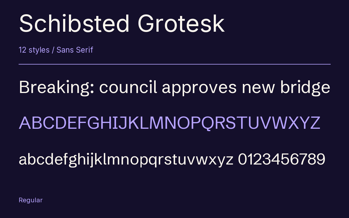
Characters & Figures
497 glyphs reported in the reference style. This selection shows 400 recorded characters.
ABCDEFGHIJKLMNOPQRSTUVWXYZ
abcdefghijklmnopqrstuvwxyz
0123456789 & @ ? !
View The Recorded Character Selection
The Font Files
Download
Schibsted Grotesk
12 TTF styles with the accompanying CSS, README and license information.
Download ZIP · 629 KB ↓- Version
- 1.100
- License
- SIL Open Font License 1.1
Install On Your Computer
Extract the ZIP first. On Windows, select the font files and choose Install from the context menu. On macOS, open the files in Font Book and choose Install.
Use On A Website
Keep the font files and the included stylesheet together. Update the stylesheet path to match your project.
<link rel="stylesheet"
  href="/fonts/schibsted-grotesk-2/schibsted-grotesk-2.css">

body {
  font-family: 'Schibsted Grotesk', sans-serif;
}
Keep the copyright and license notices with redistributed files.
Heading & Body
Compare a larger heading with the same family at reading size.
Schibsted Grotesk Heading · Schibsted Grotesk Body
Before You Travel
The morning service leaves at nine. Tickets are available at the station, and the platform is listed on the departure board. Keep your ticket until the end of the journey.