
Sharpie
Designed By
Théo Guillard
1 Style Display
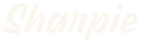
Sharpie · Regular
View the family information below and visit the publisher for font files and usage terms.
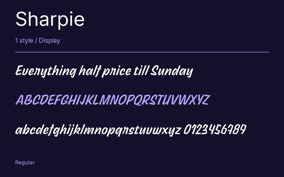
1 style available. The specimen image shows the family; live testing is available from its publisher.
Get Sharpie ↓TTF · ITF Free Font License
1 Style,
One Family
Style names from the catalog. Visit the publisher to test each style.
Regular400
Named after the marker pen, Sharpie looks more like a sign painter’s quick work with a flat brush. Théo Guillard drew it for Indian Type Foundry, and it is published on Fontshare.
Every letter slants and stands on its own. Nothing joins its neighbor, and the strokes turn at sharp angles. The a and the g are single storey. The lowercase is fairly short, while ascenders, capitals and figures all rise to about the same line, so a word gets a strong upper edge.
Across the family the contrast changes a great deal, mild in the Light and very strong by the Black.
A sale poster or a magazine headline is where it belongs. Keep the text short and big, since the angular strokes need room to be seen.
The Font Files
Download
Sharpie
Obtain the original files from the publisher. Its terms govern download and use.
Visit The Publisher ↗Read The Font License ↗Download From The Publisher
This family is listed for reference. Font files are supplied by the publisher under its own terms.