
Shippori Mincho
Designed By
FONTDASU
5 Styles Serif
The pleasure
of a well-set
page.
Shippori Mincho · Regular
Compare this serif family in headings and a continuous reading sample.
5 styles available. Compare the specimens below, or enter your own text.
Download Shippori Mincho ↓TTF · SIL Open Font License 1.1
Set Your Own Text
Change the style and size to compare the letterforms.
The last train left without us
A Page In Shippori Mincho
Shippori Mincho · Regular
Headings, labels and running text.
Notes From The Reading Room
The reading room opens onto a quiet courtyard. Along the shelves, small handwritten labels mark the collections. A visitor leaves a book open beside the window, keeping a place for the next reader.
A heading marks the next chapter. The margins leave room for a note while the text continues across the page.
5 Styles,
One Family
Every available style is shown below in its own font file.
Regular400
The last train left without us
Medium500
Preview Medium · 4.4 MB
The last train left without us
Semi Bold600
Preview Semi Bold · 4.4 MB
The last train left without us
Bold700
Preview Bold · 4.4 MB
The last train left without us
Extra Bold800
Preview Extra Bold · 4.4 MB
The last train left without us
FONTDASU had a particular reader in mind, or rather a particular writer: the Japanese novelist who wants a good Mincho without paying for it. Shippori Mincho was made to give those writers an old-style Mincho for free.
Where it comes from
Its model is the No. 5 Mincho of the Tokyo Tsukiji Type Foundry, a typeface with a large hand in shaping the Mincho style most Japanese text is set in today. The kanji were built on Genryu Mincho, an existing free font, and FONTDASU added alternate characters for readers and editors who care about particular forms.
The family grew from 2 ends. The Regular was drawn first for long-form novel text, and the Extra Bold was drawn for titles and headlines; the 3 weights in between came later to make 5 in all. FONTDASU also wanted it to hold up when enlarged, so the same face could serve an amateur writer printing a short story and an editorial designer setting a magazine spread.
There is a sister family, Shippori Mincho B1, which adds rounded corners and ink pooling. This one is the standard version, 15,363 characters per style.
For a novel we would set the body in Regular and save the Extra Bold for chapter titles, with Semi Bold as a middle step for running heads.
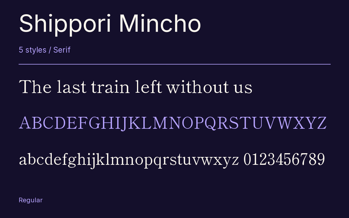
Characters & Figures
15,363 glyphs reported in the reference style. This selection shows 400 recorded characters.
ABCDEFGHIJKLMNOPQRSTUVWXYZ
abcdefghijklmnopqrstuvwxyz
0123456789 & @ ? !
View The Recorded Character Selection
The Font Files
Download
Shippori Mincho
5 TTF styles with the accompanying CSS, README and license information.
Download ZIP · 22.0 MB ↓- Version
- 3.110
- License
- SIL Open Font License 1.1
Install On Your Computer
Extract the ZIP first. On Windows, select the font files and choose Install from the context menu. On macOS, open the files in Font Book and choose Install.
Use On A Website
Keep the font files and the included stylesheet together. Update the stylesheet path to match your project.
<link rel="stylesheet"
  href="/fonts/shippori-mincho-3/shippori-mincho-3.css">

body {
  font-family: 'Shippori Mincho', sans-serif;
}
Keep the copyright and license notices with redistributed files.
Heading & Body
The family provides the heading; Inter carries the supporting text.
Shippori Mincho Heading · Inter Body
Notes From The Reading Room
The reading room opens onto a quiet courtyard. Along the shelves, small handwritten labels mark the collections. A visitor leaves a book open beside the window, keeping a place for the next reader.
Other Serif Families
Browse All Serif Fonts → Serif1 StyleFontshare
- Antic SlabSerif1 StyleGoogle Fonts
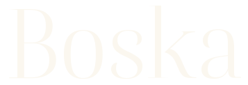 Serif1 StyleFontshare
- Josefin SlabSerif14 StylesGoogle Fonts
- FenixSerif1 StyleGoogle Fonts
- Zilla Slab HighlightSerif2 StylesGoogle Fonts