
Sixtyfour Convergence
Designed By
Simon Cozens, Jens Kutílek
1 Style Monospace
Type Specimen / 01Il1 O0
{ } [ ]
Sixtyfour Convergence · Regular
Compare letter widths, punctuation and figures in an aligned setting.
1 style available. Compare the specimens below, or enter your own text.
Download Sixtyfour Convergence ↓TTF · SIL Open Font License 1.1
Set Your Own Text
Change the style and size to compare the letterforms.
Press fire to continue
Every Position Counts
Sixtyfour Convergence · Regular
Equal-width letters and figures.
Specimen.js
const family = "Sixtyfour Convergence";

function specimen(size) {
  return { family, size };
}

specimen(24);
0123456789
9876543210
Il1 O0 {} []
1 Style,
One Family
Every available style is shown below in its own font file.
Regular400
Press fire to continue
The name comes from a fault in old monitors. A CRT fired red, green and blue at the same spot, and when the 3 drifted out of register every letter grew a colored fringe on one side. Simon Cozens took Jens Kutílek’s Sixtyfour, a rework of the Commodore 64 system font, and made a color version of it where that misalignment is the point: 3 painted layers, each one free to slip off the others the way the guns on a tired tube used to.
Kutílek had started from an article by Norbert Landsteiner on raster CRT typography, and his own Sixtyfour already tried to fake what the screen did to a pixel, the scanlines and the smear of phosphor. Cozens pushed it into color. Google added the family in July 2024.
The glyph set stays small, because the machines it copies never had many. What it does have is a drawer of graphic pieces: ━ and ┃, the rounded corners ╭ ╮ ╯ ╰, half and quarter blocks, a solid █ and a ▓ shade, the 4 card suits filled and hollow, a ✓. You can box a menu or draw a loading bar from the keyboard.
Every cell is wide. Beside Consolas a run of lowercase took 81.9% more room, so a phone screen fills up after a handful of words. Our view: go big, title cards and game over screens, and let something plainer carry the paragraphs.
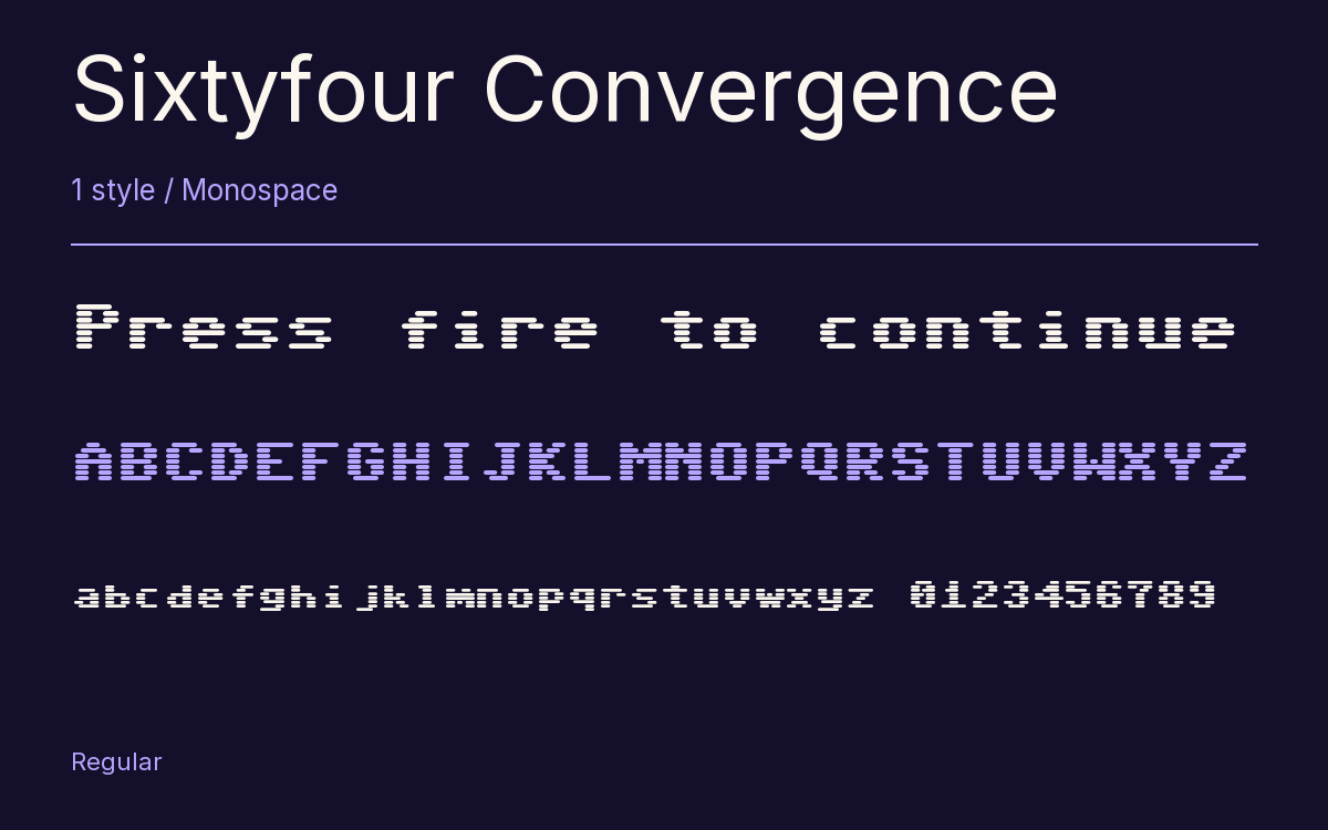
Characters & Figures
470 glyphs reported in the reference style. This selection shows 308 recorded characters.
ABCDEFGHIJKLMNOPQRSTUVWXYZ
abcdefghijklmnopqrstuvwxyz
0123456789 & @ ? !
View The Recorded Character Selection
The Font Files
Download
Sixtyfour Convergence
1 TTF style with the accompanying CSS, README and license information.
Download ZIP · 24 KB ↓- Version
- 2.001
- License
- SIL Open Font License 1.1
Install On Your Computer
Extract the ZIP first. On Windows, select the font files and choose Install from the context menu. On macOS, open the files in Font Book and choose Install.
Use On A Website
Keep the font files and the included stylesheet together. Update the stylesheet path to match your project.
<link rel="stylesheet"
  href="/fonts/sixtyfour-convergence-2/sixtyfour-convergence-2.css">

body {
  font-family: 'Sixtyfour Convergence', monospace;
}
Keep the copyright and license notices with redistributed files.
Heading & Body
The family provides the heading; Inter carries the supporting text.
Sixtyfour Convergence Heading · Inter Body
Letters, Figures & Code
Names, values and punctuation share a fixed rhythm. Compare the zero with the capital O, and the number one with the lowercase l.