
Source Serif 4
Designed By
Frank Grießhammer
16 Styles Serif
The pleasure
of a well-set
page.
Source Serif 4 · Regular
Compare this serif family in headings and a continuous reading sample.
16 styles available. Compare the specimens below, or enter your own text.
Download Source Serif 4 ↓TTF · SIL Open Font License 1.1
Set Your Own Text
Change the style and size to compare the letterforms.
Proofs due back on Thursday
A Page In Source Serif 4
Source Serif 4 · Regular
Headings, labels and running text.
Notes From The Reading Room
The reading room opens onto a quiet courtyard. Along the shelves, small handwritten labels mark the collections. A visitor leaves a book open beside the window, keeping a place for the next reader.
A heading marks the next chapter. The margins leave room for a note while the text continues across the page.
16 Styles,
One Family
Every available style is shown below in its own font file.
Extra Light200
Proofs due back on Thursday
Extra Light Italic200
Proofs due back on Thursday
Light300
Proofs due back on Thursday
Light Italic300
Proofs due back on Thursday
Regular400
Proofs due back on Thursday
Italic400
Proofs due back on Thursday
Medium500
Proofs due back on Thursday
Medium Italic500
Proofs due back on Thursday
Semi Bold600
Proofs due back on Thursday
Semi Bold Italic600
Proofs due back on Thursday
Bold700
Proofs due back on Thursday
Bold Italic700
Proofs due back on Thursday
Extra Bold800
Proofs due back on Thursday
Extra Bold Italic800
Proofs due back on Thursday
Black900
Proofs due back on Thursday
Black Italic900
Proofs due back on Thursday
Look at the b. There is a small serif at the bottom of the stem, and the w carries a serif on its middle apex. Both quirks come from Pierre Simon Fournier, the typefounder Frank Grießhammer took as his loose starting point. He did not set out to revive Fournier. The letters were simplified for screens and modern printing, and they keep a few of his habits.
Adobe made Source Serif as the partner of Source Sans, which Paul D. Hunt designed. The 2 families match in proportions and in the darkness of the text they make, and Robert Slimbach advised on both, yet they do not look like 1 designer’s work, which is part of their appeal when you mix them on a page: a serif for the reading, the sans for headings and captions.
- 16 styles, Extra Light at 200 to Black at 900, every weight with an italic
- small caps and caps to small caps, old style, lining, tabular and proportional figures, a slashed zero, subscripts and superscripts
- Latin, Greek, Cyrillic and Vietnamese
The italic sets tighter than the roman by close to 9%, and that compact cursive works well for book titles inside a sentence. For a long text, Regular or Light on paper, Regular or Medium on a screen. Black is a headline weight, or for a magazine cover line.
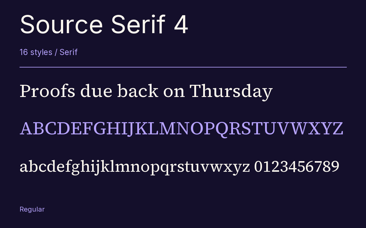
Characters & Figures
918 glyphs reported in the reference style. This selection shows 400 recorded characters.
ABCDEFGHIJKLMNOPQRSTUVWXYZ
abcdefghijklmnopqrstuvwxyz
0123456789 & @ ? !
View The Recorded Character Selection
The Font Files
Download
Source Serif 4
16 TTF styles with the accompanying CSS, README and license information.
Download ZIP · 1.4 MB ↓- Version
- 4.004
- License
- SIL Open Font License 1.1
Install On Your Computer
Extract the ZIP first. On Windows, select the font files and choose Install from the context menu. On macOS, open the files in Font Book and choose Install.
Use On A Website
Keep the font files and the included stylesheet together. Update the stylesheet path to match your project.
<link rel="stylesheet"
  href="/fonts/source-serif-4-2/source-serif-4-2.css">

body {
  font-family: 'Source Serif 4', sans-serif;
}
Keep the copyright and license notices with redistributed files.
Heading & Body
The family provides the heading; Inter carries the supporting text.
Source Serif 4 Heading · Inter Body
Notes From The Reading Room
The reading room opens onto a quiet courtyard. Along the shelves, small handwritten labels mark the collections. A visitor leaves a book open beside the window, keeping a place for the next reader.