
BIZ UDMincho
Designed By
Type Bank Co., Morisawa Inc.
2 Styles Serif
The pleasure
of a well-set
page.
BIZ UDMincho · Regular
Compare this serif family in headings and a continuous reading sample.
2 styles available. Compare the specimens below, or enter your own text.
Download BIZ UDMincho ↓TTF · SIL Open Font License 1.1
Set Your Own Text
Change the style and size to compare the letterforms.
Notes for Tuesday's science class
A Page In BIZ UDMincho
BIZ UDMincho · Regular
Headings, labels and running text.
Notes From The Reading Room
The reading room opens onto a quiet courtyard. Along the shelves, small handwritten labels mark the collections. A visitor leaves a book open beside the window, keeping a place for the next reader.
A heading marks the next chapter. The margins leave room for a note while the text continues across the page.
2 Styles,
One Family
Every available style is shown below in its own font file.
Regular400
Notes for Tuesday's science class
Bold700
Notes for Tuesday's science class
The voicing marks are the giveaway. In BIZ UDMincho the dakuten (゛) and handakuten (゜) that turn か into が or は into ぱ were drawn larger than a regular Mincho would draw them, because those 2 small ticks are the first thing to blur for a reader with low vision or on a cheap display, and a misread mark changes the word.
That is the logic of the whole family. Morisawa started from a Mincho in its own library that already had heavier horizontal strokes than the traditional style, where the horizontals can be thin enough to disappear on a screen or a sign, and then opened up the face and the counters without letting the shapes fall apart. The work went under the name universal design, and Morisawa backed it with a lot of testing on end users, looking at both how easily you tell one character from another and how easily a whole text reads.
Where it ended up matters too. In 2022 Morisawa put this face and its Gothic partner on Google Fonts and inside Google Workspace, and Google Education said the move lined them up with the fonts most widely used in Japanese education publishing. For a teacher in Japan building a worksheet in Docs, that is a fair reason to pick it from the menu.
Some practical notes:
- Regular and Bold, with 11,741 characters covering kanji, both kana, Latin, Greek and Cyrillic.
- Kana here are full width. A proportional-kana version is published separately as BIZ UDPMincho.
- A slashed zero is built in, handy in forms where 0 and O sit next to each other.
The credit in Google’s records goes to TypeBank and Morisawa together. For long reading on paper we think it is among the safer Mincho choices available free, a little plain maybe, which in a school handout is no fault.
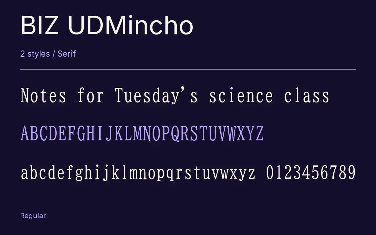
Characters & Figures
11,741 glyphs reported in the reference style. This selection shows 400 recorded characters.
ABCDEFGHIJKLMNOPQRSTUVWXYZ
abcdefghijklmnopqrstuvwxyz
0123456789 & @ ? !
View The Recorded Character Selection
The Font Files
Download
BIZ UDMincho
2 TTF styles with the accompanying CSS, README and license information.
Download ZIP · 8.1 MB ↓- Version
- 1.06
- License
- SIL Open Font License 1.1
Install On Your Computer
Extract the ZIP first. On Windows, select the font files and choose Install from the context menu. On macOS, open the files in Font Book and choose Install.
Use On A Website
Keep the font files and the included stylesheet together. Update the stylesheet path to match your project.
<link rel="stylesheet"
  href="/fonts/biz-udmincho-2/biz-udmincho-2.css">

body {
  font-family: 'BIZ UDMincho', sans-serif;
}
Keep the copyright and license notices with redistributed files.
Heading & Body
The family provides the heading; Inter carries the supporting text.
BIZ UDMincho Heading · Inter Body
Notes From The Reading Room
The reading room opens onto a quiet courtyard. Along the shelves, small handwritten labels mark the collections. A visitor leaves a book open beside the window, keeping a place for the next reader.