
Spectral
Designed By
Production Type
14 Styles Serif
The pleasure
of a well-set
page.
Spectral · Regular
Compare this serif family in headings and a continuous reading sample.
14 styles available. Compare the specimens below, or enter your own text.
Download Spectral ↓TTF · SIL Open Font License 1.1
Set Your Own Text
Change the style and size to compare the letterforms.
Draft 3, with comments resolved
A Page In Spectral
Spectral · Regular
Headings, labels and running text.
Notes From The Reading Room
The reading room opens onto a quiet courtyard. Along the shelves, small handwritten labels mark the collections. A visitor leaves a book open beside the window, keeping a place for the next reader.
A heading marks the next chapter. The margins leave room for a note while the text continues across the page.
14 Styles,
One Family
Every available style is shown below in its own font file.
Extra Light200
Draft 3, with comments resolved
Extra Light Italic200
Draft 3, with comments resolved
Light300
Draft 3, with comments resolved
Light Italic300
Draft 3, with comments resolved
Regular400
Draft 3, with comments resolved
Italic400
Draft 3, with comments resolved
Medium500
Draft 3, with comments resolved
Medium Italic500
Draft 3, with comments resolved
Semi Bold600
Draft 3, with comments resolved
Semi Bold Italic600
Draft 3, with comments resolved
Bold700
Draft 3, with comments resolved
Bold Italic700
Draft 3, with comments resolved
Extra Bold800
Draft 3, with comments resolved
Extra Bold Italic800
Draft 3, with comments resolved
Google Fonts commissioned Spectral from Production Type, and it went straight into the font menu of Google Docs, Sheets and Slides. That explains a lot about it. It is a text serif for screens and for documents people write and pass around, long reading more than headlines.
When Production Type introduced it they pointed to early digital serifs that had stayed quiet and used familiar shapes, Trinité, Demos, Colorado and Georgia, as the line they wanted to follow. The Georgia link shows up in the measurements: a passage in Spectral Regular takes almost exactly the space it would in Georgia, within 1%.
Under the hood
The OpenType side is well stocked. Real small caps, old style and lining figures in tabular and proportional fits, a slashed zero, ordinals, superscripts and 6 stylistic sets. Writers who set footnotes or quoted dates in running text will find what they need there.
The files here run from Extra Light at 200 to Extra Bold at 800, 7 weights each with an italic, and the italic is a good deal narrower than its roman. Cyrillic and Vietnamese are covered alongside Latin.
Jean-Baptiste Levée is credited with the design. Our opinion, for what it is worth, is that the Extra Light is wasted in a document editor and pretty in a large pull quote, while Regular and Medium do the everyday work.
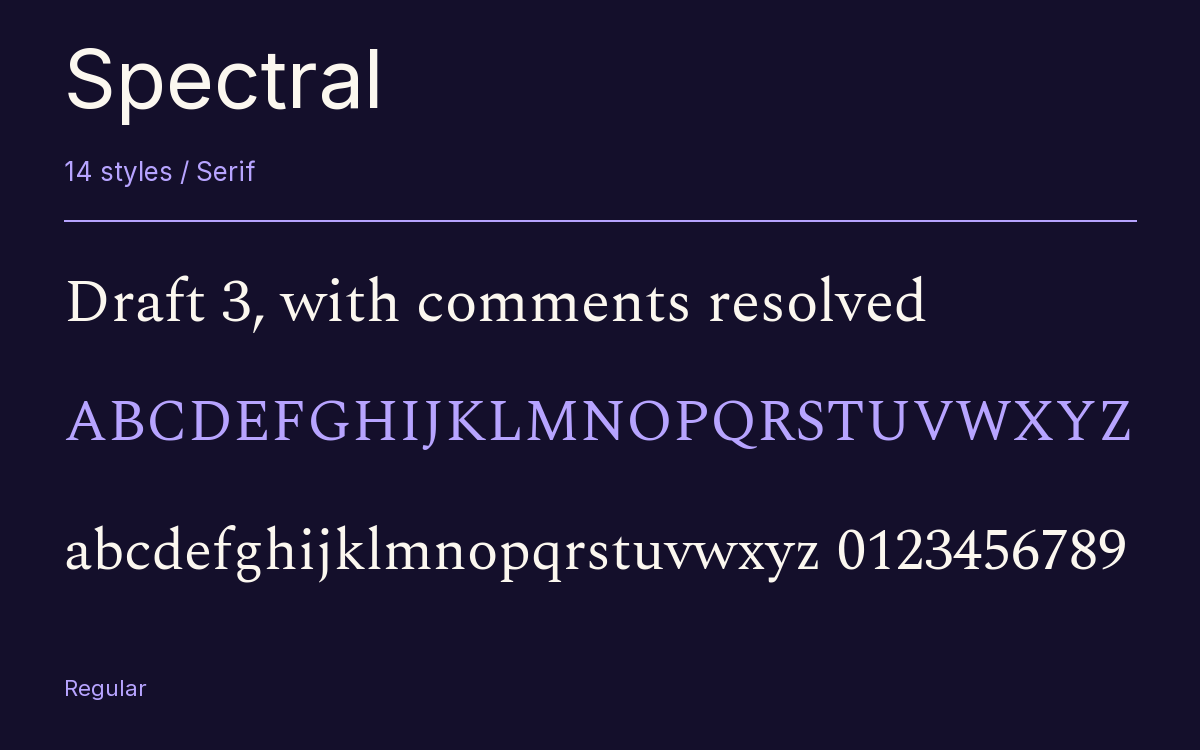
Characters & Figures
878 glyphs reported in the reference style. This selection shows 400 recorded characters.
ABCDEFGHIJKLMNOPQRSTUVWXYZ
abcdefghijklmnopqrstuvwxyz
0123456789 & @ ? !
View The Recorded Character Selection
The Font Files
Download
Spectral
14 TTF styles with the accompanying CSS, README and license information.
Download ZIP · 1.6 MB ↓- Version
- 2.005
- License
- SIL Open Font License 1.1
Install On Your Computer
Extract the ZIP first. On Windows, select the font files and choose Install from the context menu. On macOS, open the files in Font Book and choose Install.
Use On A Website
Keep the font files and the included stylesheet together. Update the stylesheet path to match your project.
<link rel="stylesheet"
  href="/fonts/spectral/spectral.css">

body {
  font-family: 'Spectral', sans-serif;
}
Keep the copyright and license notices with redistributed files.
Heading & Body
The family provides the heading; Inter carries the supporting text.
Spectral Heading · Inter Body
Notes From The Reading Room
The reading room opens onto a quiet courtyard. Along the shelves, small handwritten labels mark the collections. A visitor leaves a book open beside the window, keeping a place for the next reader.