
Wittgenstein
Designed By
Jörg Drees
12 Styles Serif
The pleasure
of a well-set
page.
Wittgenstein · Regular
Compare this serif family in headings and a continuous reading sample.
12 styles available. Compare the specimens below, or enter your own text.
Download Wittgenstein ↓TTF · SIL Open Font License 1.1
Set Your Own Text
Change the style and size to compare the letterforms.
Said clearly, or not at all
A Page In Wittgenstein
Wittgenstein · Regular
Headings, labels and running text.
Notes From The Reading Room
The reading room opens onto a quiet courtyard. Along the shelves, small handwritten labels mark the collections. A visitor leaves a book open beside the window, keeping a place for the next reader.
A heading marks the next chapter. The margins leave room for a note while the text continues across the page.
12 Styles,
One Family
Every available style is shown below in its own font file.
Regular400
Said clearly, or not at all
Italic400
Said clearly, or not at all
Medium500
Said clearly, or not at all
Medium Italic500
Said clearly, or not at all
Semi Bold600
Said clearly, or not at all
Semi Bold Italic600
Said clearly, or not at all
Bold700
Said clearly, or not at all
Bold Italic700
Said clearly, or not at all
Extra Bold800
Said clearly, or not at all
Extra Bold Italic800
Said clearly, or not at all
Black900
Said clearly, or not at all
Black Italic900
Said clearly, or not at all
Ludwig Wittgenstein held that whatever can be said at all can be said clearly, and Jörg Drees named his serif after the man for that line. The serifs are where the idea shows, clear and sharply cut.
Behind the face sit 2 older models, Georg Trump’s Mediaeval and Walter Diethelm’s Antiqua from the 1950s. Drees reworked them in a contemporary key and kept a broad-nib touch in the strokes. It started out as a normal and a bold, and it has since grown to 6 weights, Regular through Black, each with an italic, so 12 styles in all.
Is it for books or for headlines? Both, by the look of the feature list. There are old style and lining figures, each in tabular and proportional forms, a slashed zero, fractions and case-sensitive forms. The italics take almost exactly the same room as the romans, so switching a phrase to italic won’t push a line over.
I’d set long text in Regular with old style figures and let the Black handle display, where the sharp serifs get large enough to see.
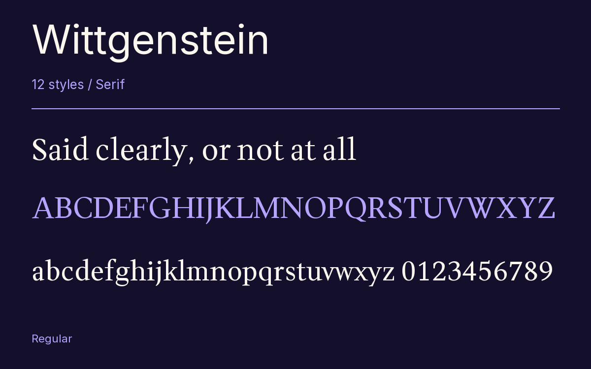
Characters & Figures
487 glyphs reported in the reference style. This selection shows 400 recorded characters.
ABCDEFGHIJKLMNOPQRSTUVWXYZ
abcdefghijklmnopqrstuvwxyz
0123456789 & @ ? !
View The Recorded Character Selection
The Font Files
Download
Wittgenstein
12 TTF styles with the accompanying CSS, README and license information.
Download ZIP · 429 KB ↓- Version
- 1.500
- License
- SIL Open Font License 1.1
Install On Your Computer
Extract the ZIP first. On Windows, select the font files and choose Install from the context menu. On macOS, open the files in Font Book and choose Install.
Use On A Website
Keep the font files and the included stylesheet together. Update the stylesheet path to match your project.
<link rel="stylesheet"
  href="/fonts/wittgenstein/wittgenstein.css">

body {
  font-family: 'Wittgenstein', sans-serif;
}
Keep the copyright and license notices with redistributed files.
Heading & Body
The family provides the heading; Inter carries the supporting text.
Wittgenstein Heading · Inter Body
Notes From The Reading Room
The reading room opens onto a quiet courtyard. Along the shelves, small handwritten labels mark the collections. A visitor leaves a book open beside the window, keeping a place for the next reader.