
Texturina
Designed By
Guillermo Torres, Omnibus-Type
18 Styles Serif
The pleasure
of a well-set
page.
Texturina · Regular
Compare this serif family in headings and a continuous reading sample.
18 styles available. Compare the specimens below, or enter your own text.
Download Texturina ↓TTF · SIL Open Font License 1.1
Set Your Own Text
Change the style and size to compare the letterforms.
Chronicle of the salt road
A Page In Texturina
Texturina · Regular
Headings, labels and running text.
Notes From The Reading Room
The reading room opens onto a quiet courtyard. Along the shelves, small handwritten labels mark the collections. A visitor leaves a book open beside the window, keeping a place for the next reader.
A heading marks the next chapter. The margins leave room for a note while the text continues across the page.
18 Styles,
One Family
Every available style is shown below in its own font file.
Thin100
Chronicle of the salt road
Thin Italic100
Chronicle of the salt road
Extra Light200
Chronicle of the salt road
Extra Light Italic200
Chronicle of the salt road
Light300
Chronicle of the salt road
Light Italic300
Chronicle of the salt road
Regular400
Chronicle of the salt road
Italic400
Chronicle of the salt road
Medium500
Chronicle of the salt road
Medium Italic500
Chronicle of the salt road
Semi Bold600
Chronicle of the salt road
Semi Bold Italic600
Chronicle of the salt road
Bold700
Chronicle of the salt road
Bold Italic700
Chronicle of the salt road
Extra Bold800
Chronicle of the salt road
Extra Bold Italic800
Chronicle of the salt road
Black900
Chronicle of the salt road
Black Italic900
Chronicle of the salt road
Blackletter for people who need to read it. That seems to be the bet Guillermo Torres made with Texturina: keep the dark, rich texture of the old broken scripts, then soften enough of the curves that a word reads at a glance and a whole line can flow.
So some curves break at an angle the way blackletter does and others are softened, and to our eye nobody has to decode anything. Omnibus-Type published it in 2020.
It also comes in a range few blackletters get. 9 weights, Thin at 100 up to Black at 900, every one with an italic, and the italics run much narrower, 10.1% slimmer than the romans across a sentence. Old-style and lining figures, a slashed zero, Vietnamese.
How far can you push it? A headline, a book cover, a magazine section opener, a label: all fine. A few paragraphs of the Regular are readable too, in a pinch, and they give a page a medieval cast without the struggle of real Fraktur. Long reading we would leave to a plainer face. The Thin is curious, a hairline blackletter, best kept very large.
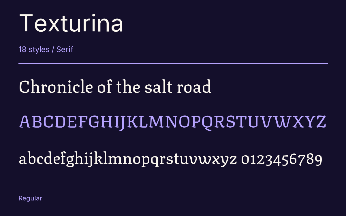
Characters & Figures
634 glyphs reported in the reference style. This selection shows 400 recorded characters.
ABCDEFGHIJKLMNOPQRSTUVWXYZ
abcdefghijklmnopqrstuvwxyz
0123456789 & @ ? !
View The Recorded Character Selection
The Font Files
Download
Texturina
18 TTF styles with the accompanying CSS, README and license information.
Download ZIP · 778 KB ↓- Version
- 1.002
- License
- SIL Open Font License 1.1
Install On Your Computer
Extract the ZIP first. On Windows, select the font files and choose Install from the context menu. On macOS, open the files in Font Book and choose Install.
Use On A Website
Keep the font files and the included stylesheet together. Update the stylesheet path to match your project.
<link rel="stylesheet"
  href="/fonts/texturina/texturina.css">

body {
  font-family: 'Texturina', sans-serif;
}
Keep the copyright and license notices with redistributed files.
Heading & Body
The family provides the heading; Inter carries the supporting text.
Texturina Heading · Inter Body
Notes From The Reading Room
The reading room opens onto a quiet courtyard. Along the shelves, small handwritten labels mark the collections. A visitor leaves a book open beside the window, keeping a place for the next reader.