
Alegreya SC
Designed By
Juan Pablo del Peral, HT Fonts
10 Styles Serif
The pleasure
of a well-set
page.
Alegreya SC · Regular
Compare this serif family in headings and a continuous reading sample.
10 styles available. Compare the specimens below, or enter your own text.
Download Alegreya SC ↓TTF · SIL Open Font License 1.1
Set Your Own Text
Change the style and size to compare the letterforms.
Proceedings of the Winter Society
A Page In Alegreya SC
Alegreya SC · Regular
Headings, labels and running text.
Notes From The Reading Room
The reading room opens onto a quiet courtyard. Along the shelves, small handwritten labels mark the collections. A visitor leaves a book open beside the window, keeping a place for the next reader.
A heading marks the next chapter. The margins leave room for a note while the text continues across the page.
10 Styles,
One Family
Every available style is shown below in its own font file.
Regular400
Proceedings of the Winter Society
Italic400
Proceedings of the Winter Society
Medium500
Proceedings of the Winter Society
Medium Italic500
Proceedings of the Winter Society
Bold700
Proceedings of the Winter Society
Bold Italic700
Proceedings of the Winter Society
Extra Bold800
Proceedings of the Winter Society
Extra Bold Italic800
Proceedings of the Winter Society
Black900
Proceedings of the Winter Society
Black Italic900
Proceedings of the Winter Society
The parent family went to Madrid first, selected in 2010 for the 2nd Bienal Iberoamericana de Diseño, and the ATypI Letter2 competition then listed Alegreya among its 53 Fonts of the Decade in September 2011, in the top 14 text type systems as well. Juan Pablo del Peral drew it at Huerta Tipográfica for literature, after a varied rhythm that keeps a long text moving, with its calligraphic roots put into a contemporary typographic language.
Alegreya SC is the small caps sister of that main family. Whatever you type comes out as capitals and small capitals, in 10 styles: Regular, Medium, Bold, Extra Bold and Black, each with an italic, and del Peral gave the italics as much care as the romans. The Black he himself called experimental for the genre.
Where do small caps on their own earn a place? Running heads, the first line of a chapter, the names in a concert program, a letterhead. That is where we would use it, with the main Alegreya setting the text below.
The coverage makes it handy for academic work as well. 1,236 characters per style take in Greek and Cyrillic with their extended sets, plus Vietnamese, so a bibliography full of Russian and Greek names stays in 1 family. Figures come old style or lining, proportional or tabular, and 5 stylistic sets sit on top.
Google has carried it since December 2011.
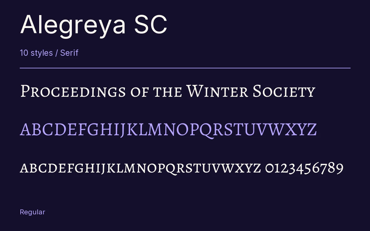
Characters & Figures
1,236 glyphs reported in the reference style. This selection shows 400 recorded characters.
ABCDEFGHIJKLMNOPQRSTUVWXYZ
abcdefghijklmnopqrstuvwxyz
0123456789 & @ ? !
View The Recorded Character Selection
The Font Files
Download
Alegreya SC
10 TTF styles with the accompanying CSS, README and license information.
Download ZIP · 1.4 MB ↓- Version
- 2.003
- License
- SIL Open Font License 1.1
Install On Your Computer
Extract the ZIP first. On Windows, select the font files and choose Install from the context menu. On macOS, open the files in Font Book and choose Install.
Use On A Website
Keep the font files and the included stylesheet together. Update the stylesheet path to match your project.
<link rel="stylesheet"
  href="/fonts/alegreya-sc-2/alegreya-sc-2.css">

body {
  font-family: 'Alegreya SC', sans-serif;
}
Keep the copyright and license notices with redistributed files.
Heading & Body
The family provides the heading; Inter carries the supporting text.
Alegreya SC Heading · Inter Body
Notes From The Reading Room
The reading room opens onto a quiet courtyard. Along the shelves, small handwritten labels mark the collections. A visitor leaves a book open beside the window, keeping a place for the next reader.