
Ancizar Serif
Designed By
Universidad Nacional de Colombia (UNAL), César Puertas, Viviana Monsalve, Julián Moncada
14 Styles Serif
The pleasure
of a well-set
page.
Ancizar Serif · Regular
Compare this serif family in headings and a continuous reading sample.
14 styles available. Compare the specimens below, or enter your own text.
Download Ancizar Serif ↓TTF · SIL Open Font License 1.1
Set Your Own Text
Change the style and size to compare the letterforms.
Notes from the Bogotá campus library
A Page In Ancizar Serif
Ancizar Serif · Regular
Headings, labels and running text.
Notes From The Reading Room
The reading room opens onto a quiet courtyard. Along the shelves, small handwritten labels mark the collections. A visitor leaves a book open beside the window, keeping a place for the next reader.
A heading marks the next chapter. The margins leave room for a note while the text continues across the page.
14 Styles,
One Family
Every available style is shown below in its own font file.
Light300
Notes from the Bogotá campus library
Light Italic300
Notes from the Bogotá campus library
Regular400
Notes from the Bogotá campus library
Italic400
Notes from the Bogotá campus library
Medium500
Notes from the Bogotá campus library
Medium Italic500
Notes from the Bogotá campus library
Semi Bold600
Notes from the Bogotá campus library
Semi Bold Italic600
Notes from the Bogotá campus library
Bold700
Notes from the Bogotá campus library
Bold Italic700
Notes from the Bogotá campus library
Extra Bold800
Notes from the Bogotá campus library
Extra Bold Italic800
Notes from the Bogotá campus library
Black900
Notes from the Bogotá campus library
Black Italic900
Notes from the Bogotá campus library
Bogotá is where this serif was drawn, by Professor César Puertas of the Faculty of Arts with Viviana Monsalve and Julián Moncada, after Universidad Nacional de Colombia, the country’s largest public university, asked in 2014 for a typeface to carry its institutional image. The fonts were used only inside the university for a decade. In 2024 it gave them away, its own words calling the release a contribution from UNAL to humanity, which is a larger ambition than most corporate fonts admit to.
The family has 2 halves. The Sans is meant for signs and headlines, and this Serif for the long stuff, essays and articles, in print that may be rough and on screens.
Ancizar Serif comes here in 7 weights from Light to Black, each with an italic, 14 files in all. The italics are a good deal tighter than the romans, close to 14% narrower across the same words, so they save room in a citation or a book title inside a sentence without changing the color of the line much. The typesetting kit is the kind a university press would ask for:
- small caps, with a feature to turn capitals into them
- old style and lining figures, both tabular and proportional
- superscripts, subscripts, ordinals and fractions
- monotonic Greek beside the Latin
The people thanked for refining it since 2014 make a long list, from Julián Prieto and José Castro to Jhon García and the university’s Digital Media Office. For a thesis or a journal, we would keep Regular and Italic for the text and let Semi Bold do the headings. The Black is heavy enough for a poster and too heavy for anything else in an academic document.
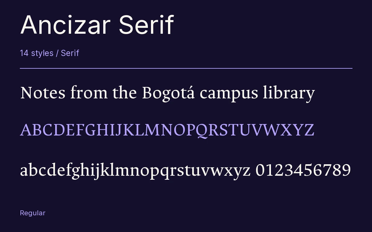
Characters & Figures
704 glyphs reported in the reference style. This selection shows 400 recorded characters.
ABCDEFGHIJKLMNOPQRSTUVWXYZ
abcdefghijklmnopqrstuvwxyz
0123456789 & @ ? !
View The Recorded Character Selection
The Font Files
Download
Ancizar Serif
14 TTF styles with the accompanying CSS, README and license information.
Download ZIP · 864 KB ↓- Version
- 8.100
- License
- SIL Open Font License 1.1
Install On Your Computer
Extract the ZIP first. On Windows, select the font files and choose Install from the context menu. On macOS, open the files in Font Book and choose Install.
Use On A Website
Keep the font files and the included stylesheet together. Update the stylesheet path to match your project.
<link rel="stylesheet"
  href="/fonts/ancizar-serif/ancizar-serif.css">

body {
  font-family: 'Ancizar Serif', sans-serif;
}
Keep the copyright and license notices with redistributed files.
Heading & Body
The family provides the heading; Inter carries the supporting text.
Ancizar Serif Heading · Inter Body
Notes From The Reading Room
The reading room opens onto a quiet courtyard. Along the shelves, small handwritten labels mark the collections. A visitor leaves a book open beside the window, keeping a place for the next reader.