
Bricolage Grotesque
Designed By
Mathieu Triay
7 Styles Sans Serif
Letters for
every day.
Bricolage Grotesque · Regular
Compare the family in headings, short labels and paragraph text.
7 styles available. Compare the specimens below, or enter your own text.
Download Bricolage Grotesque ↓TTF · SIL Open Font License 1.1
Set Your Own Text
Change the style and size to compare the letterforms.
Zine fair this Saturday, bring cash
A Clear Hierarchy
Bricolage Grotesque · Regular
Headings, labels and running text.
Departures09:00 →
Before You Travel
The morning service leaves at nine. Tickets are available at the station, and the platform is listed on the departure board. Keep your ticket until the end of the journey.
7 Styles,
One Family
Every available style is shown below in its own font file.
Extra Light200
Zine fair this Saturday, bring cash
Light300
Zine fair this Saturday, bring cash
Regular400
Zine fair this Saturday, bring cash
Medium500
Zine fair this Saturday, bring cash
Semi Bold600
Zine fair this Saturday, bring cash
Bold700
Zine fair this Saturday, bring cash
Extra Bold800
Zine fair this Saturday, bring cash
Bricolage is French for putting something together out of whatever is lying around, and Mathieu Triay meant the name literally. His sans is a collage of historical sources, technical choices and personal feeling, and it began as a fork of somebody else’s font, Mayenne Sans, a single weight open source design by Jérémy Landes of Studio Triple.
From there Triay pulled it in 2 directions. The compressed weights went toward Grotesque Nº9, a British face with an anxious, wonky streak; the regular widths toward Antique Olive, the French sans with an easy, confident manner. At small optical sizes the design calms down into something more neutral and contemporary, with deep ink traps cut into the joins.
Why British and French at once? Triay has described the font as an attempt to show what it feels like to move country and start again, to carry a hybrid identity where you can no longer be what you were and can never fully become someone else. Few type designers explain a grotesque that way. It shows in the letters, which never settle into 1 mood.
This page carries the normal width, 7 weights from Extra Light to Extra Bold, with Vietnamese. Its figures are well stocked, old style and lining, tabular and proportional. We like the heavy weights on posters; for text, Regular with old style figures switched on and a line height around 1.5.
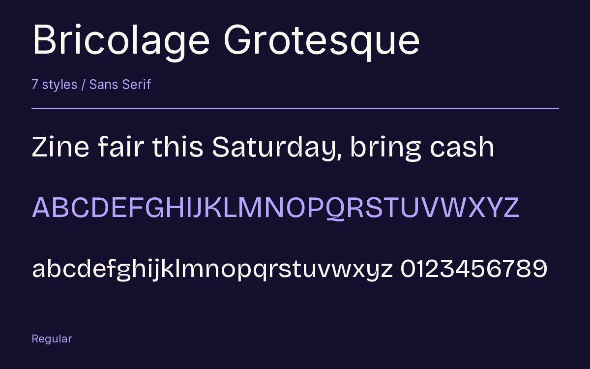
Characters & Figures
527 glyphs reported in the reference style. This selection shows 400 recorded characters.
ABCDEFGHIJKLMNOPQRSTUVWXYZ
abcdefghijklmnopqrstuvwxyz
0123456789 & @ ? !
View The Recorded Character Selection
The Font Files
Download
Bricolage Grotesque
7 TTF styles with the accompanying CSS, README and license information.
Download ZIP · 337 KB ↓- Version
- 1.001
- License
- SIL Open Font License 1.1
Install On Your Computer
Extract the ZIP first. On Windows, select the font files and choose Install from the context menu. On macOS, open the files in Font Book and choose Install.
Use On A Website
Keep the font files and the included stylesheet together. Update the stylesheet path to match your project.
<link rel="stylesheet"
  href="/fonts/bricolage-grotesque-2/bricolage-grotesque-2.css">

body {
  font-family: 'Bricolage Grotesque', sans-serif;
}
Keep the copyright and license notices with redistributed files.
Heading & Body
Compare a larger heading with the same family at reading size.
Bricolage Grotesque Heading · Bricolage Grotesque Body
Before You Travel
The morning service leaves at nine. Tickets are available at the station, and the platform is listed on the departure board. Keep your ticket until the end of the journey.