
Clash Display
Designed By
Indian Type Foundry
1 Style Sans Serif

Clash Display · Regular
View the family information below and visit the publisher for font files and usage terms.
1 style available. The specimen image shows the family; live testing is available from its publisher.
Get Clash Display ↓TTF · ITF Free Font License
1 Style,
One Family
Style names from the catalog. Visit the publisher to test each style.
Regular400
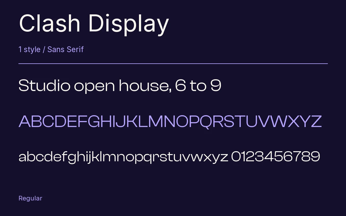
The c in Clash Display nearly closes on itself. The whole face is a neo-grotesk with its apertures squeezed down small, and it carries far more stroke contrast than its text sibling, Clash Grotesk, so the joins look pinched once the weight goes up. Indian Type Foundry credits the design to the foundry itself.
The a is double-story and the g single-story, and the figures stand at cap height with proportional spacing.
6 weights, ExtraLight to Bold, make up the family, and this download is the Regular. It was pitched as quiet enough for a corporate identity and sharp enough for a magazine cover. We would lean toward the cover.
The Font Files
Download
Clash Display
Obtain the original files from the publisher. Its terms govern download and use.
Visit The Publisher ↗Read The Font License ↗Download From The Publisher
This family is listed for reference. Font files are supplied by the publisher under its own terms.