
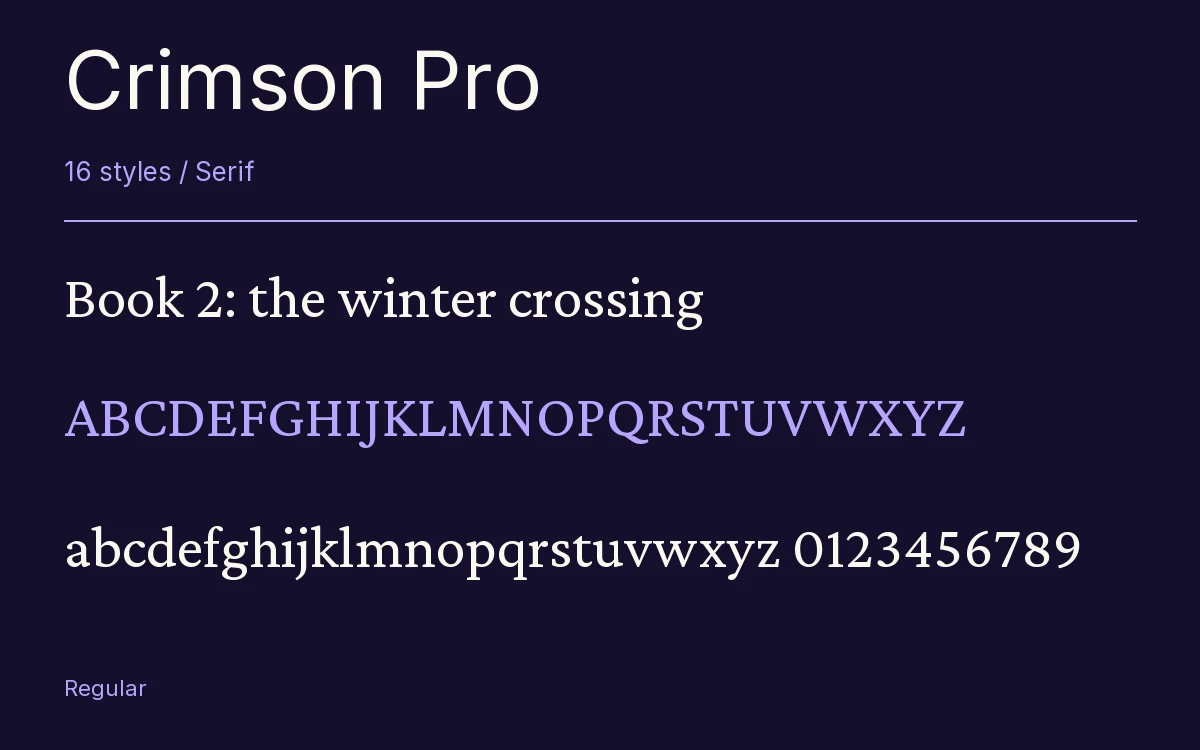
Crimson Pro
Designed By
Jacques Le Bailly
16 Styles Serif
The pleasure
of a well-set
page.
Crimson Pro · Regular
Compare this serif family in headings and a continuous reading sample.
16 styles available. Compare the specimens below, or enter your own text.
Download Crimson Pro ↓TTF · SIL Open Font License 1.1
Set Your Own Text
Change the style and size to compare the letterforms.
Book 2: the winter crossing
A Page In Crimson Pro
Crimson Pro · Regular
Headings, labels and running text.
Notes From The Reading Room
The reading room opens onto a quiet courtyard. Along the shelves, small handwritten labels mark the collections. A visitor leaves a book open beside the window, keeping a place for the next reader.
A heading marks the next chapter. The margins leave room for a note while the text continues across the page.
16 Styles,
One Family
Every available style is shown below in its own font file.
Extra Light200
Book 2: the winter crossing
Extra Light Italic200
Book 2: the winter crossing
Light300
Book 2: the winter crossing
Light Italic300
Book 2: the winter crossing
Regular400
Book 2: the winter crossing
Italic400
Book 2: the winter crossing
Medium500
Book 2: the winter crossing
Medium Italic500
Book 2: the winter crossing
Semi Bold600
Book 2: the winter crossing
Semi Bold Italic600
Book 2: the winter crossing
Bold700
Book 2: the winter crossing
Bold Italic700
Book 2: the winter crossing
Extra Bold800
Book 2: the winter crossing
Extra Bold Italic800
Book 2: the winter crossing
Black900
Book 2: the winter crossing
Black Italic900
Book 2: the winter crossing
Crimson Pro is the third go at the same idea. Sebastian Kosch started the first Crimson in 2009 and later redrew it from the ground up as Crimson Prime. Then Google brought in Jacques Le Bailly, a type designer in The Hague, to look over both versions and merge them into 1 definitive family. That merger came out in January 2019 as Crimson Pro.
Le Bailly’s brief was reading. Every decision, the project notes, went toward legibility in long texts, and the uses named are the ones you would guess: college textbooks, editorial sites, anything book length.
What you notice first is how compact it is. The lowercase is small, the letters are narrow for an old-style Garalde, and the italic is narrower again, about 9% slimmer than the roman across a sentence. On a page that means a lot of words per line and a dense, even texture, which is what a textbook wants. On a phone you may want to bump the size up a step to make up for the small x-height.
There are 8 weights, Extra Light to Black, each with its italic, and the variable version adds a continuous weight axis. For the typesetting side, old-style and lining figures in proportional and tabular widths, discretionary ligatures and fractions.
Our view: set the Regular for body copy and stay away from the Extra Light below 30 px, where its hairlines thin out. The Black is unusually heavy for a book face and makes a good, dark chapter number.
Characters & Figures
689 glyphs reported in the reference style. This selection shows 400 recorded characters.
ABCDEFGHIJKLMNOPQRSTUVWXYZ
abcdefghijklmnopqrstuvwxyz
0123456789 & @ ? !
View The Recorded Character Selection
The Font Files
Download
Crimson Pro
16 TTF styles with the accompanying CSS, README and license information.
Download ZIP · 776 KB ↓- Version
- 1.003
- License
- SIL Open Font License 1.1
Install On Your Computer
Extract the ZIP first. On Windows, select the font files and choose Install from the context menu. On macOS, open the files in Font Book and choose Install.
Use On A Website
Keep the font files and the included stylesheet together. Update the stylesheet path to match your project.
<link rel="stylesheet"
  href="/fonts/crimson-pro/crimson-pro.css">

body {
  font-family: 'Crimson Pro', sans-serif;
}
Keep the copyright and license notices with redistributed files.
Heading & Body
The family provides the heading; Inter carries the supporting text.
Crimson Pro Heading · Inter Body
Notes From The Reading Room
The reading room opens onto a quiet courtyard. Along the shelves, small handwritten labels mark the collections. A visitor leaves a book open beside the window, keeping a place for the next reader.