
Epunda Slab
Designed By
Typofactur
14 Styles Serif
The pleasure
of a well-set
page.
Epunda Slab · Regular
Compare this serif family in headings and a continuous reading sample.
14 styles available. Compare the specimens below, or enter your own text.
Download Epunda Slab ↓TTF · SIL Open Font License 1.1
Set Your Own Text
Change the style and size to compare the letterforms.
Harvest notes from the vineyard
A Page In Epunda Slab
Epunda Slab · Regular
Headings, labels and running text.
Notes From The Reading Room
The reading room opens onto a quiet courtyard. Along the shelves, small handwritten labels mark the collections. A visitor leaves a book open beside the window, keeping a place for the next reader.
A heading marks the next chapter. The margins leave room for a note while the text continues across the page.
14 Styles,
One Family
Every available style is shown below in its own font file.
Light300
Harvest notes from the vineyard
Light Italic300
Harvest notes from the vineyard
Regular400
Harvest notes from the vineyard
Italic400
Harvest notes from the vineyard
Medium500
Harvest notes from the vineyard
Medium Italic500
Harvest notes from the vineyard
Semi Bold600
Harvest notes from the vineyard
Semi Bold Italic600
Harvest notes from the vineyard
Bold700
Harvest notes from the vineyard
Bold Italic700
Harvest notes from the vineyard
Extra Bold800
Harvest notes from the vineyard
Extra Bold Italic800
Harvest notes from the vineyard
Black900
Harvest notes from the vineyard
Black Italic900
Harvest notes from the vineyard
Simon Atzbach finished the first build of Epunda Slab on Christmas Day 2024, drawn to sit next to his Epunda Sans and already with an italic. It reached Google Fonts on 20 March 2025, a day ahead of the Sans.
The serifs are short, sturdy and cut at an angle, which gives the face a traditional, solid look. Atzbach runs Typofactur, a small German foundry, and has drawn type for about 25 years next to his web, print and logo work.
The family is complete enough for real books: 7 weights, Light at 300 to Black at 900, each with an italic, plus old style and lining figures in tabular and proportional widths, fractions, superscripts and subscripts, and 2 stylistic sets. The 2025 updates brought kerning done with the Kern On tool, Polish ogonek letters, the Catalan L with middle dot and, of all things, a lozenge.
Would we use the Slab alone? For headlines, yes. For a magazine, we would set the text in the Slab and let Epunda Sans take the captions and small labels, as the 2 were drawn to work together.
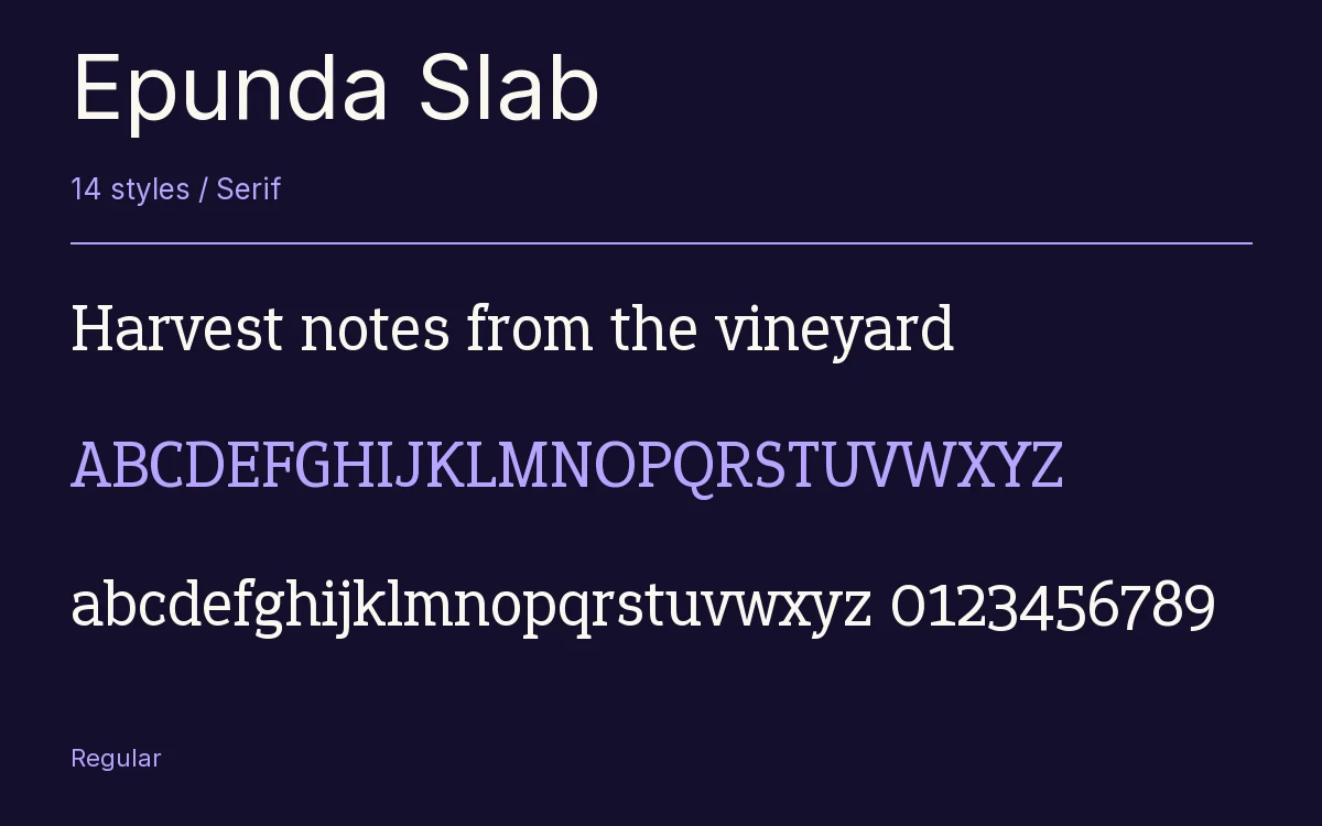
Characters & Figures
553 glyphs reported in the reference style. This selection shows 400 recorded characters.
ABCDEFGHIJKLMNOPQRSTUVWXYZ
abcdefghijklmnopqrstuvwxyz
0123456789 & @ ? !
View The Recorded Character Selection
The Font Files
Download
Epunda Slab
14 TTF styles with the accompanying CSS, README and license information.
Download ZIP · 419 KB ↓- Version
- 1.103
- License
- SIL Open Font License 1.1
Install On Your Computer
Extract the ZIP first. On Windows, select the font files and choose Install from the context menu. On macOS, open the files in Font Book and choose Install.
Use On A Website
Keep the font files and the included stylesheet together. Update the stylesheet path to match your project.
<link rel="stylesheet"
  href="/fonts/epunda-slab/epunda-slab.css">

body {
  font-family: 'Epunda Slab', sans-serif;
}
Keep the copyright and license notices with redistributed files.
Heading & Body
The family provides the heading; Inter carries the supporting text.
Epunda Slab Heading · Inter Body
Notes From The Reading Room
The reading room opens onto a quiet courtyard. Along the shelves, small handwritten labels mark the collections. A visitor leaves a book open beside the window, keeping a place for the next reader.