
Fraunces
Designed By
Undercase Type, Phaedra Charles, Flavia Zimbardi
18 Styles Serif
The pleasure
of a well-set
page.
Fraunces · Regular
Compare this serif family in headings and a continuous reading sample.
18 styles available. Compare the specimens below, or enter your own text.
Download Fraunces ↓TTF · SIL Open Font License 1.1
Set Your Own Text
Change the style and size to compare the letterforms.
Autumn issue: the bread edition
A Page In Fraunces
Fraunces · Regular
Headings, labels and running text.
Notes From The Reading Room
The reading room opens onto a quiet courtyard. Along the shelves, small handwritten labels mark the collections. A visitor leaves a book open beside the window, keeping a place for the next reader.
A heading marks the next chapter. The margins leave room for a note while the text continues across the page.
18 Styles,
One Family
Every available style is shown below in its own font file.
Thin100
Autumn issue: the bread edition
Thin Italic100
Autumn issue: the bread edition
Extra Light200
Autumn issue: the bread edition
Extra Light Italic200
Autumn issue: the bread edition
Light300
Autumn issue: the bread edition
Light Italic300
Autumn issue: the bread edition
Regular400
Autumn issue: the bread edition
Italic400
Autumn issue: the bread edition
Medium500
Autumn issue: the bread edition
Medium Italic500
Autumn issue: the bread edition
Semi Bold600
Autumn issue: the bread edition
Semi Bold Italic600
Autumn issue: the bread edition
Bold700
Autumn issue: the bread edition
Bold Italic700
Autumn issue: the bread edition
Extra Bold800
Autumn issue: the bread edition
Extra Bold Italic800
Autumn issue: the bread edition
Black900
Autumn issue: the bread edition
Black Italic900
Autumn issue: the bread edition
The n in Fraunces leans. The lean is slight, enough to look as if somebody had nudged it, and that lean is borrowed from Windsor, 1 of the soft, slightly comic serifs that early 20th century display advertising was full of. Phaedra Charles, who designed Fraunces with Flavia Zimbardi at Undercase Type, said the family owes more to Windsor than to its other sources, Souvenir and the Cooper series, and the leaning n is the most direct link.
Google Fonts asked them for it in 2018. The brief was a display face that would show what variable fonts could do, and do it with a sense of humor. They answered with 4 axes. Weight and optical size are the usual pair. Softness controls how wet and inky the letters appear, and Wonky decides whether the quirky characters are swapped in: the leaning h, n and m in the roman, and in the italic the flagged ball terminals on b, d, h, k, l, v and w. The italic itself takes after Cooper Nouveau, with an Art Nouveau streak.
What you get here
The download on this page is the static cut of all that, 18 files, 9 weights from Thin to Black with an italic each, Latin with the extended accents and Vietnamese. Static files have no axes to move, so to play with Softness and Wonky you would need the variable version from the project.
The italics run narrower than the romans, handy for a pull quote. We like the heavy weights for magazine headlines at 48 px and up, where the soft, inky shapes are visible, and Regular for a short intro paragraph underneath. For a book’s body text we would look elsewhere, since there are no old style figures.
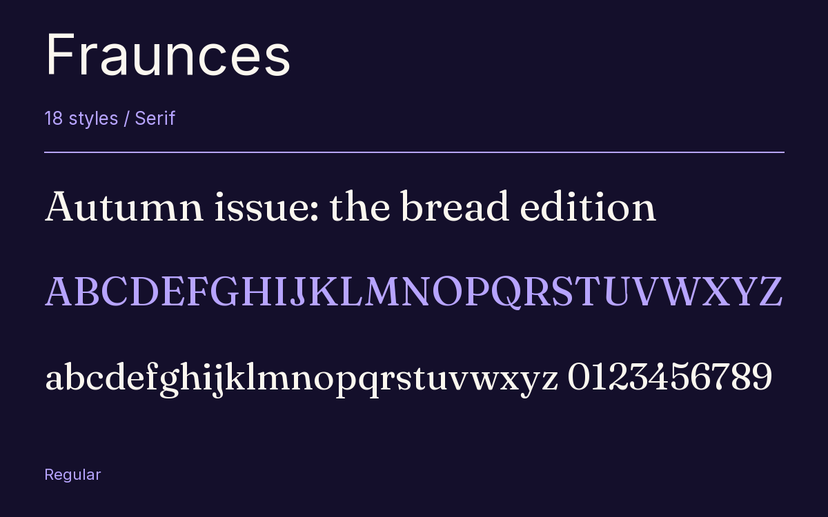
Characters & Figures
624 glyphs reported in the reference style. This selection shows 400 recorded characters.
ABCDEFGHIJKLMNOPQRSTUVWXYZ
abcdefghijklmnopqrstuvwxyz
0123456789 & @ ? !
View The Recorded Character Selection
The Font Files
Download
Fraunces
18 TTF styles with the accompanying CSS, README and license information.
Download ZIP · 797 KB ↓- Version
- 1.000
- License
- SIL Open Font License 1.1
Install On Your Computer
Extract the ZIP first. On Windows, select the font files and choose Install from the context menu. On macOS, open the files in Font Book and choose Install.
Use On A Website
Keep the font files and the included stylesheet together. Update the stylesheet path to match your project.
<link rel="stylesheet"
  href="/fonts/fraunces/fraunces.css">

body {
  font-family: 'Fraunces', sans-serif;
}
Keep the copyright and license notices with redistributed files.
Heading & Body
The family provides the heading; Inter carries the supporting text.
Fraunces Heading · Inter Body
Notes From The Reading Room
The reading room opens onto a quiet courtyard. Along the shelves, small handwritten labels mark the collections. A visitor leaves a book open beside the window, keeping a place for the next reader.