
IM Fell Double Pica SC
Designed By
Igino Marini
1 Style Serif
The pleasure
of a well-set
page.
IM Fell Double Pica SC · Regular
Compare this serif family in headings and a continuous reading sample.
1 style available. Compare the specimens below, or enter your own text.
Download IM Fell Double Pica SC ↓TTF · SIL Open Font License 1.1
Set Your Own Text
Change the style and size to compare the letterforms.
Chapter the First, of Oxford
A Page In IM Fell Double Pica SC
IM Fell Double Pica SC · Regular
Headings, labels and running text.
Notes From The Reading Room
The reading room opens onto a quiet courtyard. Along the shelves, small handwritten labels mark the collections. A visitor leaves a book open beside the window, keeping a place for the next reader.
A heading marks the next chapter. The margins leave room for a note while the text continues across the page.
1 Style,
One Family
Every available style is shown below in its own font file.
Regular400
Chapter the First, of Oxford
John Fell did not think good printing could be done with English type. He said as much in a letter of 1672, and spent the years from 1668 until his death assembling a learned press at Oxford, buying type abroad, mostly from France, Holland and Germany, and then having more made in his own workhouse.
Peter De Walpergen was the man he put on the large sizes, and Double Pica was 1 of them. Marini dates this one to an acquisition in 1684, 2 years before Fell died and left the whole collection of punches, matrices and molds to the University of Oxford, which kept it together as he asked.
This is the small caps version of the roman, 1 style. Type in lowercase and the small capitals come up beside the full ones, the old way to set the first line of a chapter or a name inside a sentence. Marini says to print it at 21 points to match the metal original. The contrast between thick and thin, heavier than in the Dutch types of the period, holds up at that size and gets coarse much below it.
Igino Marini spaced and kerned it with iKern, his own software, and there are 3 stylistic sets.
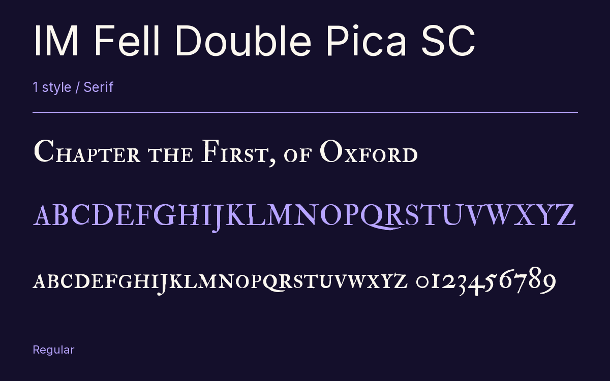
Characters & Figures
340 glyphs reported in the reference style. This selection shows 329 recorded characters.
ABCDEFGHIJKLMNOPQRSTUVWXYZ
abcdefghijklmnopqrstuvwxyz
0123456789 & @ ? !
View The Recorded Character Selection
The Font Files
Download
IM Fell Double Pica SC
1 TTF style with the accompanying CSS, README and license information.
Download ZIP · 110 KB ↓- Version
- 3.00
- License
- SIL Open Font License 1.1
Install On Your Computer
Extract the ZIP first. On Windows, select the font files and choose Install from the context menu. On macOS, open the files in Font Book and choose Install.
Use On A Website
Keep the font files and the included stylesheet together. Update the stylesheet path to match your project.
<link rel="stylesheet"
  href="/fonts/im-fell-double-pica-sc-2/im-fell-double-pica-sc-2.css">

body {
  font-family: 'IM Fell Double Pica SC', sans-serif;
}
Keep the copyright and license notices with redistributed files.
Heading & Body
The family provides the heading; Inter carries the supporting text.
IM Fell Double Pica SC Heading · Inter Body
Notes From The Reading Room
The reading room opens onto a quiet courtyard. Along the shelves, small handwritten labels mark the collections. A visitor leaves a book open beside the window, keeping a place for the next reader.