
Manuale
Designed By
Omnibus-Type
12 Styles Serif
The pleasure
of a well-set
page.
Manuale · Regular
Compare this serif family in headings and a continuous reading sample.
12 styles available. Compare the specimens below, or enter your own text.
Download Manuale ↓TTF · SIL Open Font License 1.1
Set Your Own Text
Change the style and size to compare the letterforms.
The ferryman kept a ledger
A Page In Manuale
Manuale · Regular
Headings, labels and running text.
Notes From The Reading Room
The reading room opens onto a quiet courtyard. Along the shelves, small handwritten labels mark the collections. A visitor leaves a book open beside the window, keeping a place for the next reader.
A heading marks the next chapter. The margins leave room for a note while the text continues across the page.
12 Styles,
One Family
Every available style is shown below in its own font file.
Light300
The ferryman kept a ledger
Light Italic300
The ferryman kept a ledger
Regular400
The ferryman kept a ledger
Italic400
The ferryman kept a ledger
Medium500
The ferryman kept a ledger
Medium Italic500
The ferryman kept a ledger
Semi Bold600
The ferryman kept a ledger
Semi Bold Italic600
The ferryman kept a ledger
Bold700
The ferryman kept a ledger
Bold Italic700
The ferryman kept a ledger
Extra Bold800
The ferryman kept a ledger
Extra Bold Italic800
The ferryman kept a ledger
Manuale’s italic is much more compact than its roman, 8.7% narrower across a sentence, and that gap is the first thing you feel when you set a paragraph with a few titles or foreign words slanted inside it. The italic phrases tighten, the roman around them stays put. In a news column that is useful, more words per line in the bits that need emphasis.
Pablo Cosgaya and Eduardo Tunni designed it as part of the Omnibus-Type Press Series, a group of families meant for editorial work, books, newspapers and magazines, in print and online. Google Fonts added it in December 2016, and Omnibus-Type turned it into a variable family in September 2019.
The 12 styles run from Light at 300 to Extra Bold at 800, each with its italic. For a press face the figure options matter as much as the letters, and Manuale has them: old-style numerals for running text, lining and tabular ones for results tables and prices, a slashed zero, fractions, superscripts for footnote marks.
We would set the Regular for body text around 17 or 18 px on a site and let the Semi Bold do the subheads. The Extra Bold is heavy enough for a front-page headline, though at that weight the serifs get chunky and you might prefer a sans next to it.
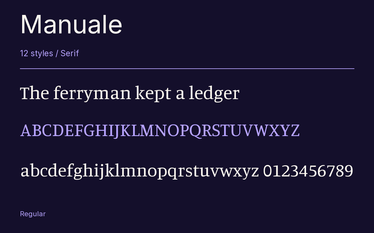
Characters & Figures
689 glyphs reported in the reference style. This selection shows 400 recorded characters.
ABCDEFGHIJKLMNOPQRSTUVWXYZ
abcdefghijklmnopqrstuvwxyz
0123456789 & @ ? !
View The Recorded Character Selection
The Font Files
Download
Manuale
12 TTF styles with the accompanying CSS, README and license information.
Download ZIP · 503 KB ↓- Version
- 1.002
- License
- SIL Open Font License 1.1
Install On Your Computer
Extract the ZIP first. On Windows, select the font files and choose Install from the context menu. On macOS, open the files in Font Book and choose Install.
Use On A Website
Keep the font files and the included stylesheet together. Update the stylesheet path to match your project.
<link rel="stylesheet"
  href="/fonts/manuale/manuale.css">

body {
  font-family: 'Manuale', sans-serif;
}
Keep the copyright and license notices with redistributed files.
Heading & Body
The family provides the heading; Inter carries the supporting text.
Manuale Heading · Inter Body
Notes From The Reading Room
The reading room opens onto a quiet courtyard. Along the shelves, small handwritten labels mark the collections. A visitor leaves a book open beside the window, keeping a place for the next reader.