
Playfair Display
Designed By
Claus Eggers Sørensen
12 Styles Serif
The pleasure
of a well-set
page.
Playfair Display · Regular
Compare this serif family in headings and a continuous reading sample.
12 styles available. Compare the specimens below, or enter your own text.
Download Playfair Display ↓TTF · SIL Open Font License 1.1
Set Your Own Text
Change the style and size to compare the letterforms.
The Autumn Collection Issue
A Page In Playfair Display
Playfair Display · Regular
Headings, labels and running text.
Notes From The Reading Room
The reading room opens onto a quiet courtyard. Along the shelves, small handwritten labels mark the collections. A visitor leaves a book open beside the window, keeping a place for the next reader.
A heading marks the next chapter. The margins leave room for a note while the text continues across the page.
12 Styles,
One Family
Every available style is shown below in its own font file.
Regular400
The Autumn Collection Issue
Italic400
The Autumn Collection Issue
Medium500
The Autumn Collection Issue
Medium Italic500
The Autumn Collection Issue
Semi Bold600
The Autumn Collection Issue
Semi Bold Italic600
The Autumn Collection Issue
Bold700
The Autumn Collection Issue
Bold Italic700
The Autumn Collection Issue
Extra Bold800
The Autumn Collection Issue
Extra Bold Italic800
The Autumn Collection Issue
Black900
The Autumn Collection Issue
Black Italic900
The Autumn Collection Issue
Set the body in Georgia or Gelasio, the project’s own notes suggest, and keep Playfair Display for the big type above it. That split is built into the drawing. Claus Eggers Sørensen, who works in Amsterdam, made it for large sizes, and the sharp drop from thick stroke to hairline that looks so good on a magazine cover would look starved in a small paragraph.
The look goes back to the late 1700s. During the European Enlightenment the broad nib quill gave way to the pointed steel pen, and as presses, ink and paper got better, printers began to favor letters with fine hairlines that had less and less to do with handwriting. Playfair borrows from that period, from John Baskerville and the Scotch Romans in particular, without copying any 1 typeface.
It came out in 2011 and was reworked heavily in 2017. In 2023 a complete Playfair, with an optical size axis, took over the text sizes, and this Display version stayed on as the cut for headlines.
6 weights, Regular up to Black, all with italics. No Light. The italics are narrower than the romans, so a Black Italic cover line packs tight and dark. Small caps are inside the main files (a separate Playfair Display SC family exists as well), next to old style figures, contextual alternates and discretionary ligatures, and the character set runs to Cyrillic and Vietnamese.
Our rule of thumb would be nothing under 32 px.
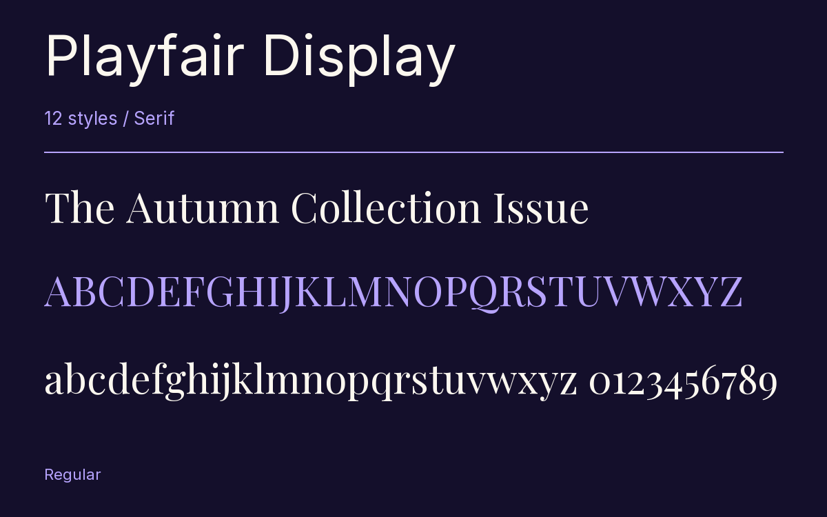
Characters & Figures
659 glyphs reported in the reference style. This selection shows 400 recorded characters.
ABCDEFGHIJKLMNOPQRSTUVWXYZ
abcdefghijklmnopqrstuvwxyz
0123456789 & @ ? !
View The Recorded Character Selection
The Font Files
Download
Playfair Display
12 TTF styles with the accompanying CSS, README and license information.
Download ZIP · 1011 KB ↓- Version
- 1.203
- License
- SIL Open Font License 1.1
Install On Your Computer
Extract the ZIP first. On Windows, select the font files and choose Install from the context menu. On macOS, open the files in Font Book and choose Install.
Use On A Website
Keep the font files and the included stylesheet together. Update the stylesheet path to match your project.
<link rel="stylesheet"
  href="/fonts/playfair-display-2/playfair-display-2.css">

body {
  font-family: 'Playfair Display', sans-serif;
}
Keep the copyright and license notices with redistributed files.
Heading & Body
The family provides the heading; Inter carries the supporting text.
Playfair Display Heading · Inter Body
Notes From The Reading Room
The reading room opens onto a quiet courtyard. Along the shelves, small handwritten labels mark the collections. A visitor leaves a book open beside the window, keeping a place for the next reader.