
Playfair
Designed By
Claus Eggers Sørensen
14 Styles Serif
The pleasure
of a well-set
page.
Playfair · Regular
Compare this serif family in headings and a continuous reading sample.
14 styles available. Compare the specimens below, or enter your own text.
Download Playfair ↓TTF · SIL Open Font License 1.1
Set Your Own Text
Change the style and size to compare the letterforms.
Notes on contrast and scale
A Page In Playfair
Playfair · Regular
Headings, labels and running text.
Notes From The Reading Room
The reading room opens onto a quiet courtyard. Along the shelves, small handwritten labels mark the collections. A visitor leaves a book open beside the window, keeping a place for the next reader.
A heading marks the next chapter. The margins leave room for a note while the text continues across the page.
14 Styles,
One Family
Every available style is shown below in its own font file.
Light300
Notes on contrast and scale
Light Italic300
Notes on contrast and scale
Regular400
Notes on contrast and scale
Italic400
Notes on contrast and scale
Medium500
Notes on contrast and scale
Medium Italic500
Notes on contrast and scale
Semi Bold600
Notes on contrast and scale
Semi Bold Italic600
Notes on contrast and scale
Bold700
Notes on contrast and scale
Bold Italic700
Notes on contrast and scale
Extra Bold800
Notes on contrast and scale
Extra Bold Italic800
Notes on contrast and scale
Black900
Notes on contrast and scale
Black Italic900
Notes on contrast and scale
At its smallest optical size, called Agate and meant for 5 pt, Playfair’s contrast flips: the horizontal strokes come out slightly heavier than the verticals. At the other end, Needlepoint, meant for 1,200 pt, the thinnest strokes are a single unit wide, so a letter set at 1,000 pt would have hairlines 1 point thick. That is a long way to stretch 1 design.
Claus Eggers Sørensen built that range into a variable design with 3 axes, width, weight and optical size, and of the 3 the optical size is the extreme one. The weight axis takes it from a light regular to a dark black. A June 2023 update tweaked the width axis so text sets narrower, and in February 2025 the glyph set grew to cover African languages.
What this page gives you
The download holds 14 static styles, Light through Black, each with an italic, and the italics run a little narrower than the romans. The OpenType list is long: small caps and caps-to-small-caps, old style and lining figures in tabular or proportional widths, a slashed zero, discretionary ligatures and 4 stylistic sets. Cyrillic and Vietnamese are covered alongside Latin.
It is pitched as a face for general purpose typesetting, and with that feature set we believe it. Our own use would be magazine work, Regular for the columns and Black for the big display lines.
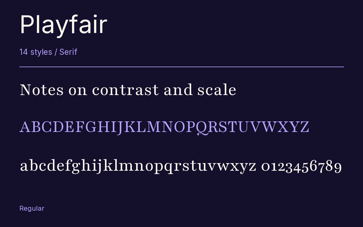
Characters & Figures
1,110 glyphs reported in the reference style. This selection shows 400 recorded characters.
ABCDEFGHIJKLMNOPQRSTUVWXYZ
abcdefghijklmnopqrstuvwxyz
0123456789 & @ ? !
View The Recorded Character Selection
The Font Files
Download
Playfair
14 TTF styles with the accompanying CSS, README and license information.
Download ZIP · 2.3 MB ↓- Version
- 2.203
- License
- SIL Open Font License 1.1
Install On Your Computer
Extract the ZIP first. On Windows, select the font files and choose Install from the context menu. On macOS, open the files in Font Book and choose Install.
Use On A Website
Keep the font files and the included stylesheet together. Update the stylesheet path to match your project.
<link rel="stylesheet"
  href="/fonts/playfair/playfair.css">

body {
  font-family: 'Playfair', sans-serif;
}
Keep the copyright and license notices with redistributed files.
Heading & Body
The family provides the heading; Inter carries the supporting text.
Playfair Heading · Inter Body
Notes From The Reading Room
The reading room opens onto a quiet courtyard. Along the shelves, small handwritten labels mark the collections. A visitor leaves a book open beside the window, keeping a place for the next reader.