
Quattrocento
Designed By
Impallari Type
2 Styles Serif
The pleasure
of a well-set
page.
Quattrocento · Regular
Compare this serif family in headings and a continuous reading sample.
2 styles available. Compare the specimens below, or enter your own text.
Download Quattrocento ↓TTF · SIL Open Font License 1.1
Set Your Own Text
Change the style and size to compare the letterforms.
Letters from a Florentine workshop
A Page In Quattrocento
Quattrocento · Regular
Headings, labels and running text.
Notes From The Reading Room
The reading room opens onto a quiet courtyard. Along the shelves, small handwritten labels mark the collections. A visitor leaves a book open beside the window, keeping a place for the next reader.
A heading marks the next chapter. The margins leave room for a note while the text continues across the page.
2 Styles,
One Family
Every available style is shown below in its own font file.
Regular400
Letters from a Florentine workshop
Bold700
Letters from a Florentine workshop
The Q is a thank-you. Pablo Impallari drew it as a small tribute to Doyald Young. Quattrocento’s tiny details only show once the type is set large; small, the face does something else: wide, open letters and a generous x-height keep body text legible, and the contrast is so low that thins are only a shade lighter than thicks.
Up close you find:
- stems that are cupped and taper into the serifs
- cupped B, D, E, F, P, Q, R and T
- almost flat top serifs on the lowercase, with the shoulders of m and n rising above them
- j and y with no serif at the bottom
An alternate M and 2 alternate W’s are included, and L and T were narrowed for better fit. Igino Marini and Brenda Gallo worked on it alongside Impallari.
Regular and Bold only, so no italic. For a sans partner, Quattrocento Sans was drawn to go with it.
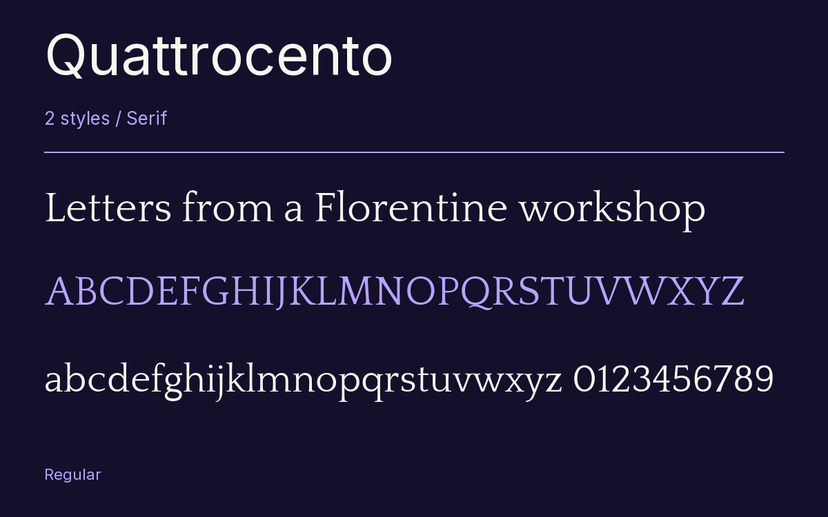
Characters & Figures
245 glyphs reported in the reference style. This selection shows 240 recorded characters.
ABCDEFGHIJKLMNOPQRSTUVWXYZ
abcdefghijklmnopqrstuvwxyz
0123456789 & @ ? !
View The Recorded Character Selection
The Font Files
Download
Quattrocento
2 TTF styles with the accompanying CSS, README and license information.
Download ZIP · 106 KB ↓- Version
- 2.000
- License
- SIL Open Font License 1.1
Install On Your Computer
Extract the ZIP first. On Windows, select the font files and choose Install from the context menu. On macOS, open the files in Font Book and choose Install.
Use On A Website
Keep the font files and the included stylesheet together. Update the stylesheet path to match your project.
<link rel="stylesheet"
  href="/fonts/quattrocento/quattrocento.css">

body {
  font-family: 'Quattrocento', sans-serif;
}
Keep the copyright and license notices with redistributed files.
Heading & Body
The family provides the heading; Inter carries the supporting text.
Quattrocento Heading · Inter Body
Notes From The Reading Room
The reading room opens onto a quiet courtyard. Along the shelves, small handwritten labels mark the collections. A visitor leaves a book open beside the window, keeping a place for the next reader.