
Redaction 20
Designed By
Jeremy Mickel, Forest Young
3 Styles Serif
The pleasure
of a well-set
page.
Redaction 20 · Regular
Compare this serif family in headings and a continuous reading sample.
3 styles available. Compare the specimens below, or enter your own text.
Download Redaction 20 ↓OTF · SIL Open Font License 1.1
Set Your Own Text
Change the style and size to compare the letterforms.
Motion to reduce bail, denied
A Page In Redaction 20
Redaction 20 · Regular
Headings, labels and running text.
Notes From The Reading Room
The reading room opens onto a quiet courtyard. Along the shelves, small handwritten labels mark the collections. A visitor leaves a book open beside the window, keeping a place for the next reader.
A heading marks the next chapter. The margins leave room for a note while the text continues across the page.
3 Styles,
One Family
Every available style is shown below in its own font file.
Regular400
Motion to reduce bail, denied
Italic400
Motion to reduce bail, denied
Bold700
Motion to reduce bail, denied
Blow Redaction 20 up to poster size and the edges turn to tiny stairs. Every curve and diagonal is built from small square steps, fine enough that a paragraph still passes for a sharp serif, coarse enough that a headline shows the grain. It is the second rung of the degraded scale, 1 step past grade 10.
Under the grain sits a design with a political picture in it. When the team behind Redaction wanted contrast with meaning, they found it on the US presidential seal, where the eagle holds arrows in 1 talon and an olive branch in the other. They pushed the letters the same way, so teardrop shapes went supple and round while the sharp parts were cut to a razor edge.
The skeleton is American legal type, Times New Roman and New Century Schoolbook. Titus Kaphar and Reginald Dwayne Betts commissioned the face for their exhibition The Redaction at MoMA PS1, and Forest Young brought in Jeremy Mickel of MCKL to draw it. Notches cut into the joins recall what a fax machine does to a letter, and the i has a square dot.
This grade comes in Regular, Italic and Bold, 346 characters each. The italic is a little more compact, 4.3% shorter than the roman over the same sentence.
For a book jacket or a long pull quote this is the grade we would reach for, since the steps only show once the type gets large.
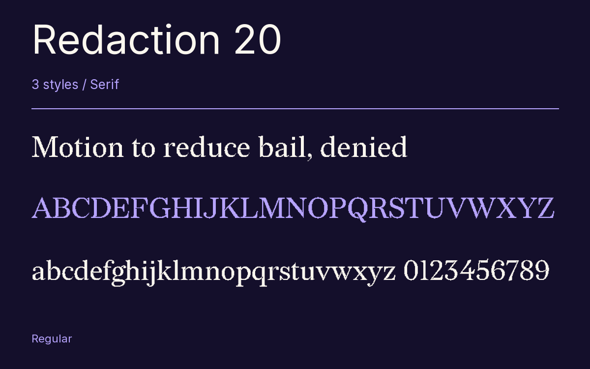
Characters & Figures
346 glyphs reported in the reference style. This selection shows 343 recorded characters.
ABCDEFGHIJKLMNOPQRSTUVWXYZ
abcdefghijklmnopqrstuvwxyz
0123456789 & @ ? !
View The Recorded Character Selection
The Font Files
Download
Redaction 20
3 OTF styles with the accompanying CSS, README and license information.
Download ZIP · 47 KB ↓- Version
- 2.001
- License
- SIL Open Font License 1.1
Install On Your Computer
Extract the ZIP first. On Windows, select the font files and choose Install from the context menu. On macOS, open the files in Font Book and choose Install.
Use On A Website
Keep the font files and the included stylesheet together. Update the stylesheet path to match your project.
<link rel="stylesheet"
  href="/fonts/redaction-20/redaction-20.css">

body {
  font-family: 'Redaction 20', sans-serif;
}
Keep the copyright and license notices with redistributed files.
Heading & Body
The family provides the heading; Inter carries the supporting text.
Redaction 20 Heading · Inter Body
Notes From The Reading Room
The reading room opens onto a quiet courtyard. Along the shelves, small handwritten labels mark the collections. A visitor leaves a book open beside the window, keeping a place for the next reader.