
Roboto Mono
Designed By
Christian Robertson
14 Styles Monospace
Type Specimen / 01Il1 O0
{ } [ ]
Roboto Mono · Regular
Compare letter widths, punctuation and figures in an aligned setting.
14 styles available. Compare the specimens below, or enter your own text.
Download Roboto Mono ↓TTF · SIL Open Font License 1.1
Set Your Own Text
Change the style and size to compare the letterforms.
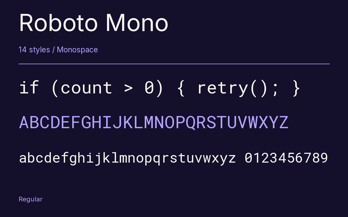
if (count > 0) { retry(); }
Every Position Counts
Roboto Mono · Regular
Equal-width letters and figures.
Specimen.js
const family = "Roboto Mono";

function specimen(size) {
  return { family, size };
}

specimen(24);
0123456789
9876543210
Il1 O0 {} []
14 Styles,
One Family
Every available style is shown below in its own font file.
Thin100
if (count > 0) { retry(); }
Thin Italic100
if (count > 0) { retry(); }
Extra Light200
if (count > 0) { retry(); }
Extra Light Italic200
if (count > 0) { retry(); }
Light300
if (count > 0) { retry(); }
Light Italic300
if (count > 0) { retry(); }
Regular400
if (count > 0) { retry(); }
Italic400
if (count > 0) { retry(); }
Medium500
if (count > 0) { retry(); }
Medium Italic500
if (count > 0) { retry(); }
Semi Bold600
if (count > 0) { retry(); }
Semi Bold Italic600
if (count > 0) { retry(); }
Bold700
if (count > 0) { retry(); }
Bold Italic700
if (count > 0) { retry(); }
The curly braces in Roboto Mono have exaggerated points, so a { never passes for a ( in a dense line of code. That is typical of how Christian Robertson treated the monospaced member of his Roboto family: the letters are related to the proportional Roboto, but whenever a fixed width asked for a different shape he changed it without fuss.
The adjustments read like a checklist for anyone who writes software:
- I, l and i grow serifs to fill their slot and keep the texture even, while the wide letters are trimmed in weight
- C and O borrow the straighter sides of Roboto Condensed
- the digit 1, lowercase l and capital I are easy to separate, and so are zero and O
- periods and commas are enlarged so they are spotted quickly, and operator symbols were rescaled and reweighted
There are 14 styles, Thin at 100 up to Bold at 700, each with an italic, and the character set covers Greek, Cyrillic and Vietnamese next to Latin. Google listed it in May 2015.
How does it compare with the mono you already use? It sets a little wider than Consolas, so you get fewer characters across a split editor pane. In exchange the letters have room, and for documentation, where code samples sit inside Roboto body text, the 2 match closely enough that the page looks like 1 family.
Characters & Figures
876 glyphs reported in the reference style. This selection shows 400 recorded characters.
ABCDEFGHIJKLMNOPQRSTUVWXYZ
abcdefghijklmnopqrstuvwxyz
0123456789 & @ ? !
View The Recorded Character Selection
The Font Files
Download
Roboto Mono
14 TTF styles with the accompanying CSS, README and license information.
Download ZIP · 787 KB ↓- Version
- 3.001
- License
- SIL Open Font License 1.1
Install On Your Computer
Extract the ZIP first. On Windows, select the font files and choose Install from the context menu. On macOS, open the files in Font Book and choose Install.
Use On A Website
Keep the font files and the included stylesheet together. Update the stylesheet path to match your project.
<link rel="stylesheet"
  href="/fonts/roboto-mono-2/roboto-mono-2.css">

body {
  font-family: 'Roboto Mono', monospace;
}
Keep the copyright and license notices with redistributed files.
Heading & Body
The family provides the heading; Inter carries the supporting text.
Roboto Mono Heading · Inter Body
Letters, Figures & Code
Names, values and punctuation share a fixed rhythm. Compare the zero with the capital O, and the number one with the lowercase l.