
Volkhov
Designed By
Cyreal
4 Styles Serif
The pleasure
of a well-set
page.
Volkhov · Regular
Compare this serif family in headings and a continuous reading sample.
4 styles available. Compare the specimens below, or enter your own text.
Download Volkhov ↓TTF · SIL Open Font License 1.1
Set Your Own Text
Change the style and size to compare the letterforms.
Notes from the river crossing
A Page In Volkhov
Volkhov · Regular
Headings, labels and running text.
Notes From The Reading Room
The reading room opens onto a quiet courtyard. Along the shelves, small handwritten labels mark the collections. A visitor leaves a book open beside the window, keeping a place for the next reader.
A heading marks the next chapter. The margins leave room for a note while the text continues across the page.
4 Styles,
One Family
Every available style is shown below in its own font file.
Regular400
Notes from the river crossing
Italic400
Notes from the river crossing
Bold700
Notes from the river crossing
Bold Italic700
Notes from the river crossing
Ivan Petrov describes the serifs on Volkhov as brutal, and they are, blunt and asymmetric. Combined with low contrast and big open counters, they make a serif that holds firm in heavy text and doesn’t go delicate on you at small sizes. The descenders are kept short, which lets you set the lines a little tighter.
The Bold has a detail most families skip. Petrov let its extra weight grow inward, into the counters, so he opened up the spacing slightly to make room, and the Bold sits a touch looser on the line than the Regular.
Then the italic goes the other way entirely: a steep slant and a calligraphic flavor, set against the strict upright. It also takes up noticeably less room across a line than the roman does.
4 styles from Cyreal, Latin only. We’d give it a whole report or a novel before a headline, and use the italic for the quotes.
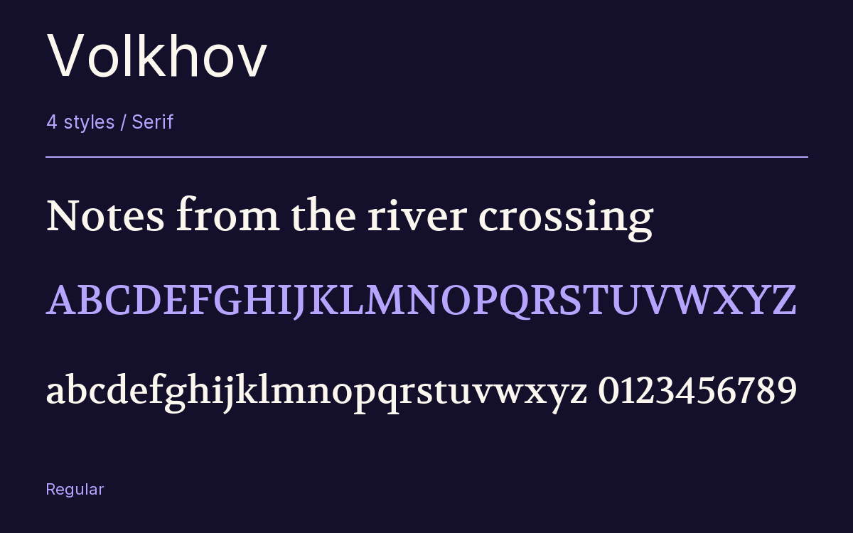
Characters & Figures
214 glyphs reported in the reference style. This selection shows 211 recorded characters.
ABCDEFGHIJKLMNOPQRSTUVWXYZ
abcdefghijklmnopqrstuvwxyz
0123456789 & @ ? !
View The Recorded Character Selection
The Font Files
Download
Volkhov
4 TTF styles with the accompanying CSS, README and license information.
Download ZIP · 140 KB ↓- Version
- 1.010
- License
- SIL Open Font License 1.1
Install On Your Computer
Extract the ZIP first. On Windows, select the font files and choose Install from the context menu. On macOS, open the files in Font Book and choose Install.
Use On A Website
Keep the font files and the included stylesheet together. Update the stylesheet path to match your project.
<link rel="stylesheet"
  href="/fonts/volkhov/volkhov.css">

body {
  font-family: 'Volkhov', sans-serif;
}
Keep the copyright and license notices with redistributed files.
Heading & Body
The family provides the heading; Inter carries the supporting text.
Volkhov Heading · Inter Body
Notes From The Reading Room
The reading room opens onto a quiet courtyard. Along the shelves, small handwritten labels mark the collections. A visitor leaves a book open beside the window, keeping a place for the next reader.